

Please work on tab grouping instead!
Or tabs not crashing when you want to move them between different windows.
I really hope you can turn this off
There’ll be a setting in about:config no doubt.
why? It’s objectively better?
it also shows the url of the page, super convinientIt’s objectively worse. Fancier but objectively worse.
Another big, distracting pop-up that has no benefit over the existing tool tip which is still distracting when it pops up unintentionally. Also the preview will use more system resources.
It’s objectively worse. Fancier but objectively worse.
It isn’t though, Firefox stock tab management is awful, when you pile up a decent number of tabs you can’t even see the name of the tab properly, this happens in all the browsers ofc, but at least you can have more tabs opened without this being an obstacle.
You really need 3rd party add-ons to manage your tabs with Firefox, unlike in Chrome, Vivaldi, or even Safari.
With this feature at least you can have a quick look at your tabs easily, just like with the aforementioned browsers… Now I really hope they could add a button like Safari where you can see all your tabs too…
It’s not objectively better or worse. Some people will prefer it and some people won’t.
your gpu is actually much slower at text rendering than rendering images
Here I’m still waiting for an official vertical tabs feature.
In the meantime, Floorp has it built-in to the browser.
I was aware of Floorp and had no particular interest in trying it until now. On my way to install it now!
Last time I looked at Floorp was when it was first announced and it seemed to just be hardened Firefox, similar to Librewolf. It’s gained a ton of features since then!
I think it has better customization than librewolf and (beta iirc) integration with tree style tabs and vertical tabs. Although I haven’t used it for long (2-3 months) the experience has been great. It has been my recommendation for anyone coming from Chrome.
If this defaults to on, I’m turning it off.
Out of curiosity, why? If it’s a knee-jerk reaction to change that’s completely understandable, but I can’t see anything to dislike about the feature itself
I can already read the title of the page and see the favicon, so it actually doesn’t show new information. If I accidentally move my mouse there it covers a big part of the page i’m looking at
If you have many tabs opened:
I can already read the cropped title of the page and see the multiple favicon
When I shop online, I have many tabs from the same site open. The tab title is the store name + the item name, so the item name never fits. A bunch of identical ebay icons is way worse than this.
I understand it may be useful for some people, but I’m simply not one of them
But that’s not what you wrote. You claimed that it doesn’t show new information because you can see the favicon and title. It does show new information.
On top of the fact that those previews are annoying as hell as other comments pointed out, I want to add that this kind of feature also uses a fair amount of processing + memory.
I think that is a nice opt-in feature for those who wants it but I like my default light and simple.
I think it’s more that there really isn’t a need for this. If I’m not sure what a tab is I can always click on it. Chromium got this a while back and (even with minimal exposure to Chromium) I didn’t like it, it weirdly felt annoying and unnecessary.
stop resisting!
This has been people’s reactions to anything good that comes into Firefox for close to 20 years now
I am a longtime Firefox user. I absolutely love many innovative feature Firefox has implemented (such as container tabs). Firefox does so many things better than other browsers, such as allowing CTRL-clicking tabular data for copy-and-paste.
However, I’m usually annoyed by features they add that seem like they’re just doing it to be like the dominant browser.
The worst was when they reassigned CTRL+I from getting page info to match IE’s behavior of viewing favorites. Thankfully, they’ve gone back to the sane behavior.
It’s a good feature, and probably makes sense to default to on. But I know I’ll find it more distracting than useful, so I’ll turn it off.
Large tooltips on mouseover are usually distracting. Facicons, text, and additional windows do enough to remind me what my tabs are.
New features often aren’t helpful to each and every user, but as long as I can turn off the ones that are actively unhelpful to me, I’m perfectly happy to see them.
This is just a clear sign of struggling with change adaptation bruh.
Gladly Lemmy userbase is so tiny compared with FF userbase that it won’t influence Mozilla decisions to not implement this at all…
And you’ll probably be able to deactivate it as they say so… ¯\_(ツ)_/¯
If this defaults to off, I’m turning it on.
Mozilla look for most useless stuff to implement.
Tab. Groups.
Yes
Not a fan of Edge, but absolutely love the tab groups. Use them at work all the time.
Tab groups, vertical tabs, synced Workspaces. I’ve hacked together most of it, but being able to have separated pages of tabs synced through my account would be a godsend. Only thing keeping me on MS Edge.
I don’t know why I never vibed with vertical tabs, but I’ve just never been able to make it work mentally. And I could see a double-edged sword with synced workspaces (I think having a button to click and see open tabs on other devices is a perfect middle ground). Personally, tab groups is the only thing I miss from Chromium. I used the feature for grouping, but also for labeling tabs: “Check back Tuesday,” or “Don’t forget to follow up,” or whatever. If they gave us tab groups and then never updated Firefox again, I think I would be pretty happy.
EDIT: well okay not happy, but I would be satisfied with the browser we ended up with.
I miss the days with Opera. Not only could it group tabs, but it had previews too. Mouse gestures. Keyword searches. Page link filters and batch operations. RSS-reader. Chrome didn’t even exist back then, and IE and Firefox are still playing catch up. Kinda amazing to think about it.
Vivaldi is the spiritual successor, but having to use chromium rendering engine, it’s so many concessions and steps back. Has the mouse gestures, tho.
The gestures were amazing. Some are ingrained in my muscle memory after all these years.
Same here. And the single-key shortcuts for switching tabs. Modern browsers don’t even come close.
Brave has configurable keybinds, you can set any key you want to do anything.
However I still need to use the vimium extension to have proper keyboard only web navigation, because with the exception of qutebrowser none of the “popular” web browsers have the select link mode with the f key.
I never got used to the f-key navigation, if i can’t use shift+arrows i fall back to mouse.
I don’t know, maybe Brave has this, unfortunately some time before Opera 9 and now I became one of these annoying people who only use FOSS.
Missing the days when developing a new browser was possible.
This was already a thing for ages until they killed it, but it is still possible if you are okay with tweaking userChrome.css
Why Mozilla wastes resources on their own implementation instead of providing API’s to third party developers is beyond me.
Your first link is based on XUL, which was deprecated because it was wasting resources being unmaintainable and insecure.
Here’s a great article about that
Admittedly, yes, XUL was a complete shitfest. Though I remember that it was more due to security patches and poor memory management that caused the apparent poor performance, not so much for addons. I was on waterfox classic at the time of writing of this article and had like 30 addons enabled, including TST, CRT, and TileTabs. all non-e10s-blocking, and, I assure you, it was just as fast(and slow) as quantum.
But, that’s besides the point. Customization, especially via addon’s, was one of the defining features of Firefox. Before, you had opera, which you could customize it within certain limits, Firefox if you want full control, and IE if you’re a dummy. Now, you have Vivaldi if you want customization within certain limits, Chrome if you’re a dummy, and Firefox is… just… not chrome? I’d say the addons should’ve been kept at all costs, maybe in a different way, without amputating the whole browser. But they did and it lost it’s appeal to a major portion of people. Of course there are still exclusive features like container tabs and min vid, but those are not exclusive to quantum either. The whole ordeal sounds just like that time when Yandex, in order to solve a support ticket overflow, just removed the contact support button.
This person said XUL is insecure! Any Palemoon users here? Anyone wanting to tell them that Mozilla is totally taking away user Freedom and that Palemoon is a totally secure Browser? XD
Shhh, they’ll hear you
1000ms delay seems to be little too much to my liking, changed
browser.tabs.cardPreview.delayMsto 500 and it feels much better.Preview is pretty short for some reason, it might be related to my monitor (32:9) aspect ratio?
deleted by creator
Nice! I remember using an extension for that back in the day
Actually I was going to look up such an extension, but then I read this news (some days ago here… This is Lemmy after all…) But then I’d rather wait for the official implementation.
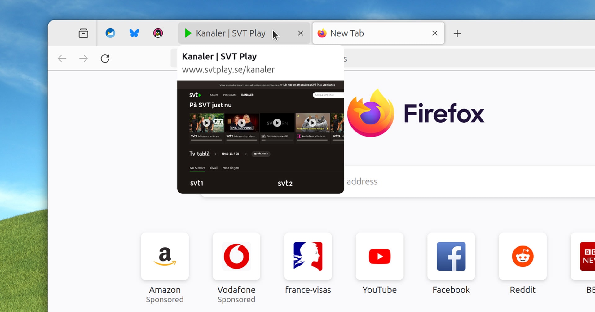
In current versions of Firefox you hover your mouse over a non-active tab […] to see (after a small delay) a tooltip containing the web page title.
Uh… what is the point of that? If I am looking for a specific tab then:
- I probably want to switch to the tab that I am looking for, so staying on the current one is not required
- if there are a few tabs from different pages from the same domain the difference might be hard to see on a thumbnail (similar page headings with logos)
- and most importantly: opening the tab is faster than waiting for the delay anyway
This sounds like a “cool” feature that’s looking for an actual problem to solve.
came here looking for this exact comment. Agree with all point (last one most importantly).
Firefox team should look at what Arc browser is doing.
I suspect the small delay is just to prevent them from going crazy if you swing your mouse over the tab bar, it’s not going to be like a second or something. Sounds useful for the case of multiple tabs on the same site with similar titles, especially at higher resolutions.
It’s a second https://sopuli.xyz/comment/6926705
Ok… That’s too long. Weird decision.
This is not even close to the worst thing they have ever done, but stuff like this is a waste of resources. People mostly want official vertical tabs and more than anything engine performance improvements. (and the ability to pretend to be Chrome in Youtube)
I think many people in the comments suffer from some version of curse of knowledge.
Sure, this feature us quite irrelevant for a power user who is quick to navigate the browser and needs a split second to remember what tab it is simply by reading the header and seeing the icon.
However, many less proficient people can benefit from this feature. Not once I saw how someone who has 10 tabs open and needs to go to a different webpage, starts meticulously clicking through every single one of them because they have no idea how the page they are looking for is called, they are too overwhelmed by using web as a whole to take notice.
Oh great. As if my life doesn’t have enough curses on it.
Removed by mod
I don’t understand how someone can have 10 or more tabs open. The times when I have “many” tabs open is when I’m looking for references while doing art, and that still hardly ever surpasses 5 tabs! XD
I think it’s much easier to have more than to have less. Most people I encounter have such a mess of pages in their browser, makes my hair stand on end. If we continue to approach this as an accessibility feature, it starts to make even more sense since tons of users have so many tabs they only see icons, not page names
I often get myself into a position where I have 50+ tabs open, but then I get annoyed with all the damn tabs and go on a purge… furiously clicking X on tabs down the line until I have it down to something manageable. This happens every couple of days. I wish there was a setting where one had the option of limiting themselves to x amount of tabs and if you hit the limit you know it’s time for a purge. I’ve seen where chromium browsers also have tab groups… I’m not sure if that helps for tab hoarding, I guess it could be more organized that way, but also sounds like it just enables more tab hoarding.
Have they ever said if vertical-tabs is a feature they will add? Vivaldi and Edge both support it by default and it’s awesome.
By vertical tabs do you mean tabs on the side instead of the top? If so, check out the tree-style tabs extension, it’s great.
The extension is awkward to use imo. The way Vivaldi has it integrated for example is miles better and I really want to see Firefox do same.
I find that Firefox manages tabs better. So eveb though i use side tabs on vivaldi, I prefer them on top in Firefox, and it’s just a keystroke away to see the list vertically, but not stay that way.
For what it’s worth vertical tabs is currently 3rd most rated suggestion
deleted by creator
Yeah I always turn off that previi crap immediately as it usually gets in my way of doing things. Please don’t even spend time on this feature, I don’t really see the use


