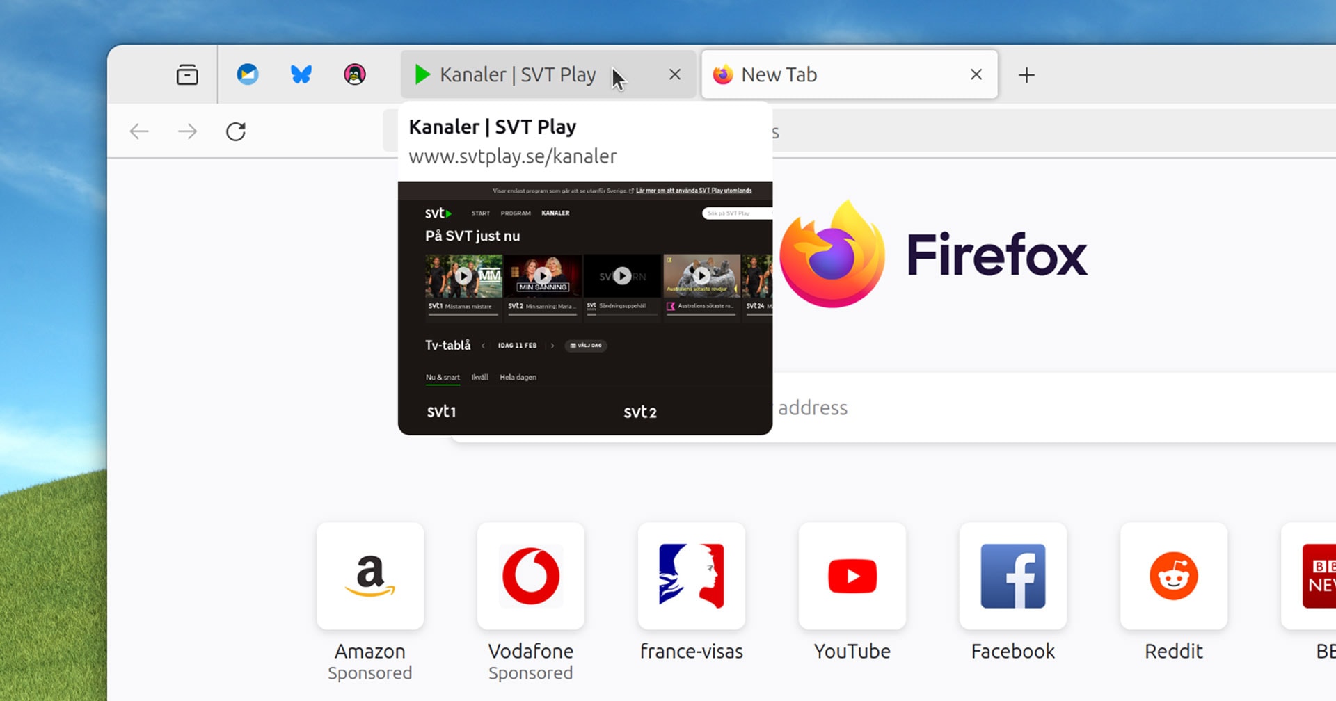
Tab previews are in the works for a future release of Mozilla Firefox. In current versions of Firefox you hover your mouse over a non-active tab (i.e. any
Out of curiosity, why? If it’s a knee-jerk reaction to change that’s completely understandable, but I can’t see anything to dislike about the feature itself
I can already read the title of the page and see the favicon, so it actually doesn’t show new information. If I accidentally move my mouse there it covers a big part of the page i’m looking at
When I shop online, I have many tabs from the same site open. The tab title is the store name + the item name, so the item name never fits. A bunch of identical ebay icons is way worse than this.
But that’s not what you wrote. You claimed that it doesn’t show new information because you can see the favicon and title. It does show new information.
On top of the fact that those previews are annoying as hell as other comments pointed out, I want to add that this kind of feature also uses a fair amount of processing + memory.
I think that is a nice opt-in feature for those who wants it but I like my default light and simple.
I think it’s more that there really isn’t a need for this. If I’m not sure what a tab is I can always click on it. Chromium got this a while back and (even with minimal exposure to Chromium) I didn’t like it, it weirdly felt annoying and unnecessary.
I am a longtime Firefox user. I absolutely love many innovative feature Firefox has implemented (such as container tabs). Firefox does so many things better than other browsers, such as allowing CTRL-clicking tabular data for copy-and-paste.
However, I’m usually annoyed by features they add that seem like they’re just doing it to be like the dominant browser.
The worst was when they reassigned CTRL+I from getting page info to match IE’s behavior of viewing favorites. Thankfully, they’ve gone back to the sane behavior.
It’s a good feature, and probably makes sense to default to on. But I know I’ll find it more distracting than useful, so I’ll turn it off.
Large tooltips on mouseover are usually distracting. Facicons, text, and additional windows do enough to remind me what my tabs are.
New features often aren’t helpful to each and every user, but as long as I can turn off the ones that are actively unhelpful to me, I’m perfectly happy to see them.


If this defaults to on, I’m turning it off.
Out of curiosity, why? If it’s a knee-jerk reaction to change that’s completely understandable, but I can’t see anything to dislike about the feature itself
I can already read the title of the page and see the favicon, so it actually doesn’t show new information. If I accidentally move my mouse there it covers a big part of the page i’m looking at
If you have many tabs opened:
When I shop online, I have many tabs from the same site open. The tab title is the store name + the item name, so the item name never fits. A bunch of identical ebay icons is way worse than this.
I understand it may be useful for some people, but I’m simply not one of them
But that’s not what you wrote. You claimed that it doesn’t show new information because you can see the favicon and title. It does show new information.
On top of the fact that those previews are annoying as hell as other comments pointed out, I want to add that this kind of feature also uses a fair amount of processing + memory.
I think that is a nice opt-in feature for those who wants it but I like my default light and simple.
I think it’s more that there really isn’t a need for this. If I’m not sure what a tab is I can always click on it. Chromium got this a while back and (even with minimal exposure to Chromium) I didn’t like it, it weirdly felt annoying and unnecessary.
This has been people’s reactions to anything good that comes into Firefox for close to 20 years now
I am a longtime Firefox user. I absolutely love many innovative feature Firefox has implemented (such as container tabs). Firefox does so many things better than other browsers, such as allowing CTRL-clicking tabular data for copy-and-paste.
However, I’m usually annoyed by features they add that seem like they’re just doing it to be like the dominant browser.
The worst was when they reassigned CTRL+I from getting page info to match IE’s behavior of viewing favorites. Thankfully, they’ve gone back to the sane behavior.
It’s a good feature, and probably makes sense to default to on. But I know I’ll find it more distracting than useful, so I’ll turn it off.
Large tooltips on mouseover are usually distracting. Facicons, text, and additional windows do enough to remind me what my tabs are.
New features often aren’t helpful to each and every user, but as long as I can turn off the ones that are actively unhelpful to me, I’m perfectly happy to see them.
This is just a clear sign of struggling with change adaptation bruh.
Gladly Lemmy userbase is so tiny compared with FF userbase that it won’t influence Mozilla decisions to not implement this at all…
And you’ll probably be able to deactivate it as they say so… ¯\_(ツ)_/¯
If this defaults to off, I’m turning it on.
Mozilla look for most useless stuff to implement.