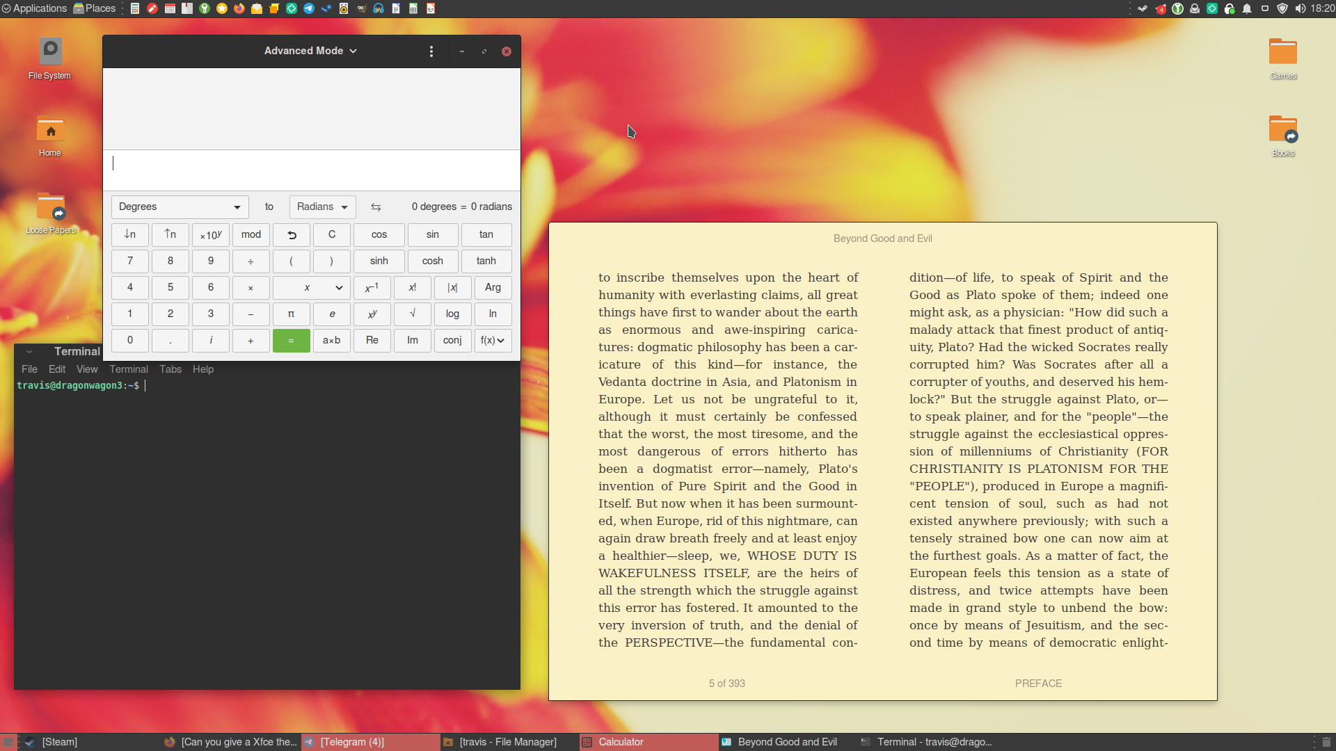
My two favorites are Arc (pick your variant) and Greybird.
Agreed. Arc-Dark is my go-to. I use Nord theme on all my stuff, so naturally I’ve tried some Nord xfce/gtk themes, but Arc-Dark blends with my nord-styled applications well enough and feels better than the “real” Nord themes.
That’s a main reason I like Arc. I decided to change things up a bit and use Dracula on everything, but I still prefer the more subdued blueish hue of Arc and Nord.
I like the defaults a lot. I use greybird (light variant) on my non-XFCE desktop.
If you want something different maybe give matcha a try: https://github.com/vinceliuice/Matcha-gtk-theme
I like the defaults a lot.
Same honestly. I personally really like Breeze Dark on KDE Plasma, I tried a lot of other themes, but none quite had the polish and consistency of the default IMO.
I really love Numix/NumixBlue and Moka Icons (Recommend install Faba), I remember that I had problems with the bluetooth icon in systray but nothing that creating a symbolic link to the correct icons does not solve :)
I always use Arc-Dark with Numix Circle icons :)
I really like the sweet theme, I only used xfce for a little while but it made it very nice when I did. I also use the sweet KDE theme and its awesome.
I like greybird-dark using the default xfce window buttons. imo when you go for something flatter or more modern, xfce looks kinda tacky.
Big fan of the Qogir GTK theme: https://github.com/vinceliuice/Qogir-theme
also the WhiteSur GTK theme by the same author: https://github.com/vinceliuice/WhiteSur-gtk-theme
Both are really high quality themes.
My favaurite is PRO-dark-XFCE-4.14 with tela icons.
I use Mint-Y-Darker-Red with ePapirus icons (folder color changed to orange with the folder color tool) and the Mint-Y-Dark Red xfwm theme and the Breeze cursor. I swear by it. It’s the last theme I’ll ever need.
