um, okay but this specific distortion is unhelpful to me. it just shows the extent of the distortion, not what the new map would be. the new map is the most pertinent piece of info.
Every few years this comes up again, and every time some nonsense about colonialism or whatever is brought up.
There is no “true” size or “true” shape on a 2D projection of Earth’s very 3D surface. We used the one projection for so long because of how coastal shapes don’t get bent way out of proportion, but like with any projection, messes with the other aspects.
Rather than making spicy click bait titles every so often about the “true” projection of the Earth, how about we teach kids at school what it takes to project something 3D on a 2D surface?
And just use a fucking globe!
I mean, before the advent of GPS, ships at sea got a “fix” of their position by taking two measurements: north/south latitude (via a sextant when the sun was visible) and east/west longitude (via a set of very accurate clocks that showed the time in Greenwich England, which could be easily compared to the time aboard ship). Mercator maps are just a grid showing where all the land is as a function of these two measurements on the X and Y axes. Any other projection would have just meant a lot more work figuring out where shit was, which is why Mercator became “the” map. It had absolutely nothing to do with any attempt to make Europe appear dominant – Europe’s dominance when these maps came into existence was too obvious and unquestioned to need any parlor tricks.
As a neurodivergent map person, I’m over-aware of the difficulties of map projection. And I agree that simply calling this new projection ‘accurate’ is misleading
But at the same time, the use of the Mercator as the standard default map in situations that have nothing to do with ocean navigation for literally hundreds of years is absolutely a reflection of the relative power of the Global North, and can’t be dismissed as ‘nonsense about colonialism’
Exactly. It’s easy to brush off the idea of soft power but it has real consequences.
The Mercator projection really seems to be Africa-centric if anything
In what way? It inflates the size of areas as they get further away from the equator, resulting in Africa being portrayed as relatively much smaller than it is compared to Europe and North America
Africa is by far the most accurately portrayed part of the map, and it’s right in the center.
The center - east to west - is 0 degrees longitude, defined as the Royal Observatory in Greenwich, England. This does also go through West Africa
The center - north to south - is 0 degrees latitude, defined as the equator.
Because of this, Africa is central on the vast majority of world map projections including the Mercator and the Equal Earth.
Accuracy is relative. The Mercator distorts areas bigger the further away they are from the equator. This exaggerates the size of the USA, Europe etc compared to Africa.
Now I’m imagining a dick measuring contest where the men care more about whose is measured most accurately for some reason, rather than showing off how long their dick is
it’s in the center?
You know it’s the Reverse Mercator right?
It’s been the best way to transform a curved surface to a plane surface in a way that people understand.
It’s not the Reverse Mercator… I’m not sure what that is
Do you mean Transverse Mercator? Although it’s not that either
so coming from you pleasr tell us what would be the best way to project an as accurate as possible world map? I mena both in 3D version and as a 2D version
A 3D version would be a globe. A 2D version is inherently inaccurate because it’s 2D and the earth is not. You are free to pick your poison in the manner of your projection but you will always loose something.
So when it comes to picking a 2D poison which ome would be currently best? The new UN map ? or …
Or would a better solution for 2D be a ‘collection’ of pictures of the Earth from numerous different angles? And we just look at each of the angles seperately as their own seperate 2D picture of different parts of the Earth? So Im talking we supposedly take 14 or 20 or more different pictures of the Earth from 14 or 20 or more different angles of the Earth then we just lay out each of those pictures and it is up to the viewer to look at each picture of each angles of the Earth and to do what they can in their head with those pictures. Bad idea, good idea?
It is complete nonsense. Use makes something standard, and maps have most been used in navigation. So it naturally becomes the default.
This is how ALL defaults become defaults, even when they’re wrong.
What better alternative projection they could use at the time for navigation?
I don’t know? That’s not what we’re talking about. We’re talking about the UN using it not for navigation in 2026
You might note that the present is, in fact, not 500 years ago.
Is that the answer to my question?
If you’re asking me to tell you the best way to navigate 500 years ago, I can’t help you because I’m not a historian. The point is that really has absolutely no bearing on how we should use maps today in the present.
And the present doesn’t affect the past.
from the perspective of an art conservationist i’m not entirely sure i agree.
Isn’t this incorrect though? As far as I am aware it is possible to represent true size (equal-area) or true shape (conformal), but not both at the same time
Yeah, isn’t that what I said?
I read it as neither one is possible, but maybe it’s on me.
Well, I meant is when projecting something in 2D, you’re making a sacrifice somewhere.
I don’t really understand the difference, but Greenland is not bigger than Australia right?
wait. is yo mamma fatter in greenland or NZ? what if we remove NZ from the map?
No
Think of opening the earth up onto a cylinder and stretching it out and over its surface, then flattening that cylinder out.
It will be equal in the centre, but distorted at the ends.
The projection we use is the Reverse Mercator, as its ‘cylinder’ sits vertical so to speak, distorting the poles. Horizontally, it would distort across the Equator in a couple places, which wouldn’t be useable.
The projection we use is just the Mercator. Horizontally, it’s called a Transverse Mercator
For political uses new projection is better. UN body are not going to use that to navigate.
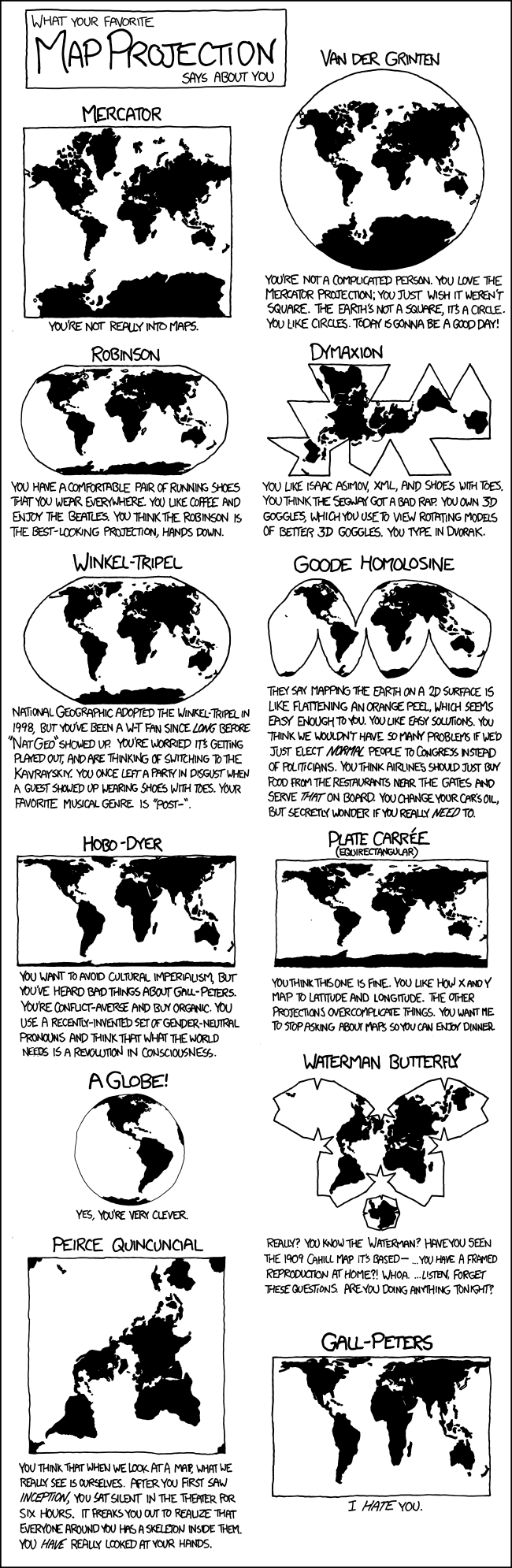
I’m going with the Gall–Peters Projection: https://youtu.be/vVX-PrBRtTY
I’m so sick of this shit. You want an accurate map? Buy a globe. There is no accurate flat map projections. All are wrong. Different projections have different flaws and serve different purposes.
Maps are especially used in education, i see it very hard to include a globe with every book and set up a big ass globe in every classroom but whatever
i remember during the breakup of yugoslavia our history teachers, who thought it important that we not only were familiar with but had memorized the capitals, names and locations of all the countries in the world and states in the us (literally that’s all we did one year for history. memorize locations and names and blah blah. that damn animaniacs song was a godsend to anyone who had a vcr). so they were bitching and moaning that they were having to buy new map rolls what seemed like every year because another country was declaring independence.
i was too young to tell whether he was being sardonic, like “they had to fight for independence and all i gotta do is get a new map pack woe is me” or if he was really complaining. but they have the good projectors now. should be a lot easier.
Also, unless you’re using a paper map, you should never have to see a flat map projection.
We all carry around supercomputers in our pockets that can easily do the math to render a globe. If we want to use a bigger screen, they have even more powerful processors.
Does anybody actually use paper maps at all anymore? I guess sometimes people mount them on the wall and point at them, but I mean using a map to calculate distance, find a path, etc.
What’s ridiculous is that even though computers should be rendering the world as a globe, some websites (even Google Maps) still sometimes use Mercator. It’s especially ridiculous when it’s something like a flight-tracking website where the flight is going in a straight line on the globe, but is rendered as a curved path on a stupid map projection.
For most navigation people are going less than 50 miles projecting it onto a virtual globe would be pointless and not in any way shape or form beneficial.
I mean the good thing about a flat projection is that you can see everything at once. When you’re comparing data points of different countries it is nice to see them on a flat map. Neither the actual size nor the angles really matter in that case.
When you’re comparing data points of different countries
Why would you need a map for that? That seems like something where a table is more useful.
Does anybody actually use paper maps at all anymore
if i’m going hiking, yes. i don’t trust the phone to maintain a connection in the wild.
Would be nice to see Antarctica
Pfft, you believe in Antarctica? Sure, a wHoLE ConTiNenT cOVeEreD in IcE.
Covered in ice for now.
Don’t worry. We’re well on schedule to fix that.
deleted by creator
Everyone else: uses a globe
I was already aware how big Africa really is. I’m actually more surprised that Greenland is smaller.
deleted by creator