I just refuse to watch any YT video where they make a face like this in the splash image.
OP, if this video is yours, sorry, but not very.
Agreed. Most Youtube thumbnails are cancer. Bug eyes with mouth wide open or pointing at something. Enough already.
Tom Scott did an episode where he explained that going back and retrofitting old videos with the shock face and click bait titles upped his views by a lot
And that is what nobody cares to admit. They do those thumbnails cause they work.
Great for Tom Scott and everyone one using this (sincerely) and everyone attracted to videos with images like this.
I am still out.
And around 70% of titles are replaced by DeArrow for me, and of the other 30% around 80% are probably just too unknown. So in total just 6% are actually not clickbait, and those 6% are basically just dashcam channels with the numbering as title, the largest german channel about Lego-style bricks and media.ccc.de
yt creators really don’t have a choice, if they deviate from the stuff that the algorithm likes it kills the channel
Check out Technology Connections. Very successful channel. Not a single clickbaity face in sight. It has the bold text, sure, but it mostly describes the actual video.
I think you missed the critical word “deviate” if you stick to the same thing it works, whatever it is
There are successful channels which don’t do this.
I can’t blame a creator for doing this, but I do lose a lot of respect for them when they do.
I do the same. I don’t care if there is an algorithm or not, I don’t care if you get 0,00001% more money. The end doesn’t justify the means. I am on a personal vendetta, every time I am on YT and I see a thumbnail like that or one with clickbait text or arrows. It’s instant don’t recommend channel. I don’t care if I am subbed to that channel or not. Stop finding excuses, we need a gram of human decency, stop whoring yourself like that
I’m subscribed to his channel for years and in my opinion its the best Linux content on YouTube. And its the first time I see this face as a thumbnail, but to be honest, the had a few strange ones too. If I were not subscribed to his channel and would not know that he makes good content, then I would probably come to the same conclusion to not watch the video based off the thumbnail. I sometimes refuse to click a video based on the title too!
But I don’t know what it is, but this content from him is the worst in years (in my opinion)! So the thumbnail fits nicely and you don’t need to see it anyway. It’s not worth watching it. But I’m serious when I say that you should check out his other videos, if you look for Linux content. He does often amazing job of history stuff too, and content that others don’t report on.
I like light themes and agree that they can be done well. Overall my problem with dark themes is they are too low contrast everything melts into everything else. Who doesn’t want a distinct border around a window?
I was a light theme user for very long time, until a few years ago I met Vim with the theme gruvbox (dark). Check out gruvbox, it’s my favorite theme of all time. Often there are multiple variants from it, with slight difference in contrast and coloring. For long text reading I prefer black on white, but nowadays I use dark themes for operating system and many other stuff. Especially for programming / scripting its much more readable as dark theme, for whatever reason.
I’m still conflicted, because most dark themes suck, but most light themes are acceptable. Have a look here, gruvbox has a light theme and dark theme: https://github.com/morhetz/gruvbox

looks at the KDE settings with window borders and title bars disabled
I think what Brodie showed at the end was already really great. I know a graphics designer and number 1 rule is to never use black and white.
But of course this only works if you have full control over all apps, libadwaita? Dont theme my apps? Damn Electron?
I have astigmatism, so I can’t work with dark themes. I can’t read correctly when everything is black around. For me, the perfect theme is the one that has a black window manager, gray variations on specific widgets, and white windows (the background desktop image I prefer it to be blue-ish). Basically, to work properly, I need a mostly light, but mixed environment that provides contrast. Not all white, and definitely not all black. So far, I haven’t found such a theme, because no GUI environment allows for such specificity in theming for the various widgets. Although the default Gnome theme ain’t too bad.
Huh, I should look into that - I have astigmatism and with LCD & OLED monitors its much easier for me to read light text on dark background.
The font effects the clarity for me much more.
dark themes are fine but they’re horrible on TN/cheap IPS panels
That’s why I use light mode, looks miles better in my IPS
Why is that?
the contrast of black on white isn’t uniform because of bad viewing angles
Oh, that trick where you could make the screen unreadable by tilting it far back enough.
To be honest, this seems to me like a pretty bad take with weird and kind of BS arguments. Why are professional designer, both those working for some of the biggest tech companies and those working in open source project, making these choices? It couldn’t be for actual reasons or because they actually prefer it like that. No, they are “afraid of color”. Or implying that dark theme exist because of these black on white themes, as a mean to escape it. It just weird backwards logic to justify his taste and shouldn’t be necessary to just state that he prefer a different kind of themes.
To me, the Windows themes he showed as positive examples look way to cluttered and busy, even though they don’t show this much information. I don’t need the theme to be “exiting”, I need them to display the information in an easily readable way. And dark theme aren’t there just for people who dislike the modern light theme. Having a light and a dark theme (and ideally having the app follow your system preference) actually serves a purpose. You can actively switch between them depending on the context, the time of day, the brightness of the room or any other reason to make the screen easily readable and comfortable to look at.
Layan with a transparent Kvantum theme
layan looks so nice but it’s so slow :(
Can’t go away from Breeze Dark.
I tried a few themes but always go back to Breeze Twilight (dark bar with light windows).
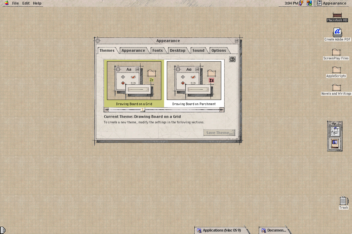
Not what you asked (Plasma theme), but my favorite UI theme since always has been MacOS Drawingboard:
https://www.appimagehub.com/p/1219916Wishing it was possible on Linux for +20 years…
If you add an “!” Before the image link it is displayed in line!
I use a Medium theme on my desktop. It’s not dark or light. It really works for me.
I found it here, https://github.com/blue-mood/blue-mood-kde-color-scheme
I was actually looking for a Med-Dark charcoal theme and decided to try this first. I’ve used it for years now.I tried making a KDE theme too and it either looks like that, or random parts are colored differently.
But everything blue… haha no thanks