
who even decides what’s “modern” anymore?
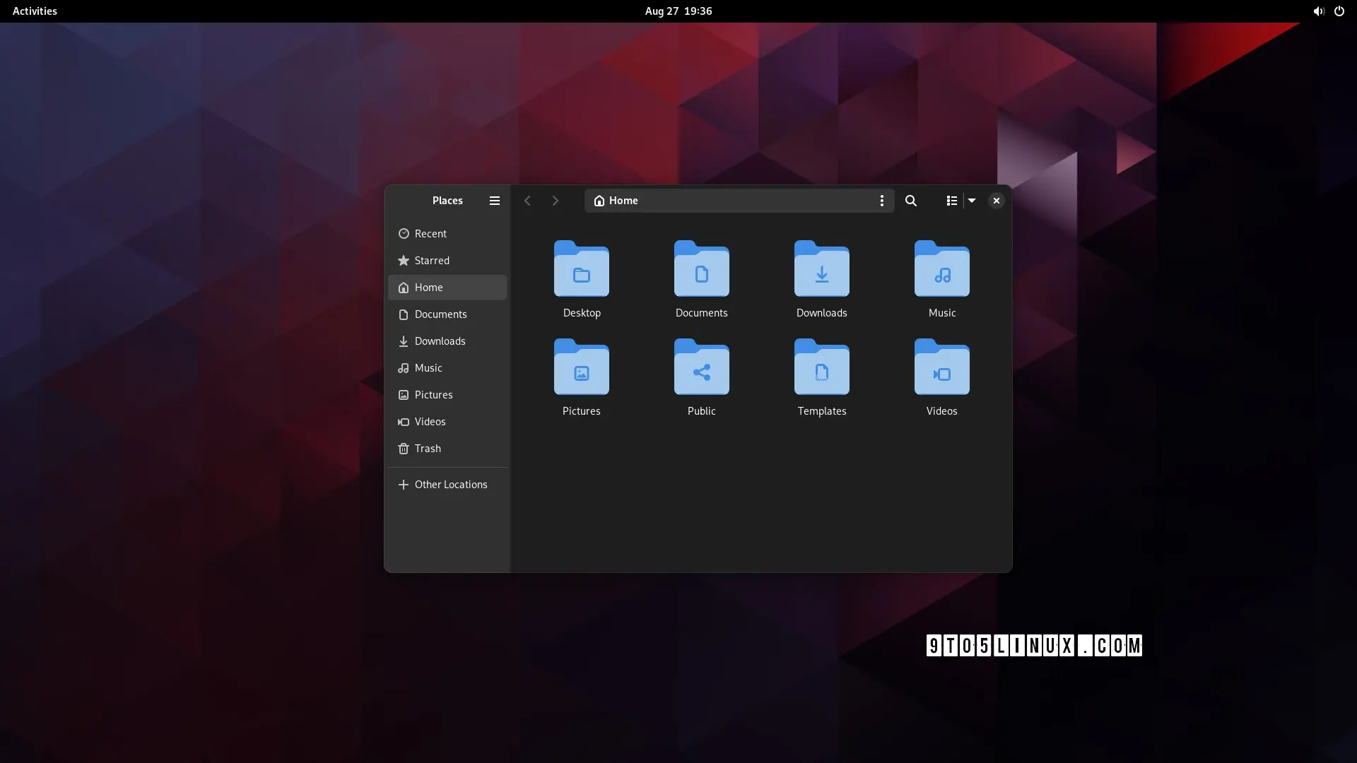
can anyone, honestly, without reading the article (or guessing from the headline), tell me which of these is the "modern" design?


edit: people are getting confused by the fact that one is tree view, not icons view so i changed the image. old image here
Apparently “modern” means hiding options behind extra clicks
i may be blind but what exactly was hidden behind one or more clicks?
Notice Min/Max buttons missing from window bar?
That’s the default.
tbh not the best choice but that’s just their design language I guess. what I was asking about tho was this post’s redesign specifically
I think “modern” can be interpreted as nice and clean UI which is beautiful to watch and only the absolutely most important stuff is shown and the rest is hidden. So, like apple design approaches, I guess. Say form over function. Microsoft tends to go that route as well. Luckily for user who like function over form, there are different flavors of Linux.
deleted by creator
Corpo’s and social media “designers” who would throw out their own mother because she’s “outdated”
Honestly as someone who doesn’t use Gnome… I can’t really tell much of a difference, Seems like a strange thing to build hype over.
as a GNOME user I also don’t get the hype lol
hey as long as it has thumbnail preview I will be hyped.
It’s just my opinion (since it’s not in the article) but a thing that makes Gnome and Libadwaita a “modern design” is the fact that the production behind it tries to bridge the gap between a “mouse and keyboard” and a “touch screen” workflow.
None of the other DEs come even close to Gnome when used on a tabletAgreed, I’m not an expert, kind of new to linux, but I could see being very comfortable on a Gnome based tablet.
meh, subjectively i find that creates a “worst of both worlds” situation. but this comment was more about the futility of the development time that went into this specific feature
this comment was more about the futility of the development time that went into this specific feature
yeah sorry, I should have been more specific with my answer: features like this are supposed to help you in a touch screen situation or in general with smaller screens.
When the window is resized under a certain size, the left panel becomes hidden and with it part of the top bar, to make it less cluttered and confusing.but …surely you could just do the same thing with the old design? artist’s rendition:

in fact, now i look at it, it makes them look even more similar once i collapse the sidebar
The difference is minimal, in the newer version you have 1 less element when the sidebar is collapsed (the hamburger menu).
Generally speaking Gnome 44 is already well optimized, 45 is going to be a more “tweaks and small improvements” kind of update rather than a big design changes
Petition to force anyone talking about software to use “trendy” or “fashionable” instead of “modern”.
The first one doesn’t waste space in the title bar by expanding the locator and navigator buttons there.
It’d be kinda nice if they made these kinds of changes options rather than just deciding this is best
Could honestly take it or leave it, doesn’t really add anything
-
Adding options
-
Gnome desktop
Pick one.
-
i’m not even sure it’s worth having an option. i don’t think i’d even have noticed a difference, apart from the menu button being in a slightly different place to every other gnome app. it’s fine; but it wasn’t worth the development time
The last thing I want is an option for this. My gosh, imagine the amount of options you would end up with if every single design choice was turned into an option. Who in the world would like that many options.
I’m happy to just have a design team work on whatever they think looks better and works best for the user experience, and implement it after some rounds of public review and testing. This looks neat enough to me - slightly less cluttered than what my current Nautilus window looks like while maintaining the same functionality.
Who in the world would like that many options.
KDE fans?
Awww, Plasma fans, you know I’m playin’.
yep, that’s me
Seriously, I envy you guys. Every time I try to use Plasma, I end up spending all my time tweaking the desktop, and by the time I’m done, I realize I’ve just recreated the Gnome workflow…
every time i try to use gnome, i end up spending all my time going “dammit, where are all the bleeding features”
(also the lack of fitts’ law adherence due to that pointless bar at the top)
That’s the neat thing. It’s so customizable, you can turn it into another desktop environment.
I tried KDE, it’s cool but I get the same thing of trying to recreate gnome/pantheon
It kinda sucks in GNOME when there’s just one thing you would like to change though
Have been trying to get a tiling window manager on GNOME but all the gnome extensions that do it kinda suck
Well I just switched to KDE Plasma last week and I’m pleasantly surprised just how many things are configurable via a menu and how well it runs on Wayland With a Nvidia GPU.
I used to despise KDE Neon, and used Gnome for a bit, but I don’t think I can go back anymore until their design philosophy changes again.
Problem for me is KDE is dependant on configuration to get it to look nice, GNOME looks nice and works well out of the box but sucks if you want to do anything ontop of that base
“Modern” means copying Mac OS or iOS.
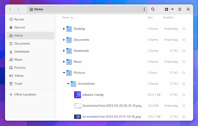
Honestly, I haven’t yet seen the article, the light theme one is probably newer because of tabs.
Anyways both look like an android app, I know most will hate reading this but Windows Explorer rules.
nah, i agree with you. win explorer with qttabbar, tortoisegit, and some tweaks from winaerotweaker
dolphin is pretty good though and it has some features that explorer doesn’t, like a terminal pane
Great. Now do split panel!
And column browse
I’d love a setting to change the default file manager. I always install Nemo and configure it to be the default but last I checked, it’s not a simple GUI setting like changing the default browser or email client or whatever. And then you end up with two programs called “Files,” which obviously isn’t ideal.
Would it be that much of a problem to have what app is “Files” be a simple setting? Maybe it’s way more complicated than one assumes.
My dream is that one day we will be able to assign default applications to the “generic” names in Gnome. Launch “Browser” and open Firefox (or chrome 🤢), Files and open Dolphin, Messages and open Elements etc etc.
Obviously I can do the same with custom .desktop files but it would be a nice flair to use the settings to just assign applications to those generic names.
On my kids’ pcs the default file manager is nemo and they use gnome, so it is possible
Most DEs do include the file manager in the default applications menu. You can also use xdg-mime to set it as the default for inode/directory
Until some app doesn’t care about xdg-mime. At least I had some issues with firefox a while ago.
Firefox uses xdg-mime or xdg portals, depending on the configuration of the package. If you are using it as a flatpak, it will use portals.
Apps using portals will use the file picker your portal provides. This will usually be either the GNOME or Plasma file picker. Note that this file picker is separate from your default file manager.
It wasn’t about the file picker but the file manager that opens after clicking the button to open the folder a downloaded file is saved in. It was indeed flatpak firefox iirc.
It did work at some point but broke again… At the moment it works I believe (at least I didn’t get a call from my mom about the file manager being wrong again).
What’s the advantage vs. the current version?
Also looks like it’s removing an important visual affordance (i.e., which areas you can click to drag the window), unless I’m misinterpreting it
The current version has some problems with adaptivity, e.g. resizing the app window can cause issues. This led to the creation of new libadwaita widgets. If you want to read the technical details, see https://blogs.gnome.org/alicem/2023/06/15/rethinking-adaptivity/
Been a Gnome user for years and always glad to see them modernize the UI more, but the one thing I desperately want is .stl and/or .3mf thumbnailers to just work with Nautilus. Tried several times to set up in Fedora using f3d, but instead just get blurry question mark thumbnails
I don’t think I can go back to Nautilus after using Dolphin for so long, even if the search is far better.
I find Dolphin wy better… But renaming & adding files to new folder is better on Nautilus, but as I don’t care much about renaming anymore, and Dolphin is quick enough to surpass the other feature, meh
Looks nice, but if I could trade these visual gimmicks for a type-ahead feature, I would do so in a heartbeat.
gtk3-classicanyone?
Wow, revolutionary.
Not a fan of slicing up the title bar like that, to be honest. Yeah, it saves some space, but I’m on a desktop with plenty of screen space, so that really isn’t a priority, and being able to easily move windows around is a priority.
Also, what the hell is wrong with old-fashioned menus? This isn’t a phone. GNOME doesn’t even run on phones.
That’s the thing. There is no title bar. The title bar, if forced to exist, would go above both of those sections.
GNOME apps seem to have been headed in this direction for a while.
If I open gnome-disks, for example, the title bar is kind of odd because it doesn’t show the name of the program at all. It only shows the size of the currently selected disk, and underneath that in a smaller text subheading is the actual device pathname of the disk. How many other programs do you know that have a subheading under the window title in the title bar?
This feels like an early decision to do something different with that part of the window.
Further along in the evolution is the dconf-editor which no longer shows any kind of title bar at all. The window manager shows that the window title is “dconf Editor” but there’s nothing on the window itself that says that.
Earlier versions of each definitely had a standard title bar (I remember dconf-editor having one fairly clearly, because the new interface seemed strange at first), but not any more.
There’s also that desktop web browsers generally request that their title bar not be shown. Given that everyone has at least one browser window open, it would be almost foolish to assume there’s been no influence from that design choice.
There’s also that desktop web browsers generally request that their title bar not be shown.
Those have the excuse that they’re basically several windows in one, and the tabs are the title bar-equivalents. Very few apps have that excuse, though.
Side note: KDE’s tabbed windows feature was pretty neat. Too bad it’s gone.
But GNOME is being patched to run on phones!
As a laptop user I love the idea that some of the titlebar space being utilized. I don’t use GNOME though. I hope there will continue to be good UXs for both of us.
Even my laptop has a large-ish display (17 inch). Really not a fan of small displays. Sure, large laptops are heavy, but I could use the exercise. 😄
Gotta keep up with Apple you know ahah
Only if they could copy the original Exposé from macOS Tiger.
I just want someone to finally copy column view from Finder. I know Ranger has it but it would be nice if Nautilus or Dolphin would implement it.


