For what i heard, a lot of people on the Linux community use Krita for image manipulation, even though, it’s intended for digital painting, and GIMP is the one intended for image manipulation, because people don’t like the GIMP’s UI.
My issue is, i never understood why they don’t like the GIMP’s UI, since i never have issues with it,(Although it’s probably because i’m used to the UI) so i need to adress this problem and ask you What does the GIMP UI has that you don’t like or hate so much and why you like Krita’s UI over GIMP’s?
Before you event comment your answer i need to ask you to do the following:
-
Address each specific issue along with an concise and direct explanation of why you don’t like it
-
Answers such as “I just don’t like it”, “I don’t like where it’s placed” or anything alike doesn’t count as “Concise and Direct”, we are adults, not 4 year old children.
-
If you can provide a suggestion of how GIMP’s UI can be improved, it would help a lot, and maybe this issue can be solved.
-
If someone else commented something you were about to comment, upvote them, this way we can address the most common issues effectively.
-
I need you to watch the screenshots of both UI’s, because something that most people don’t know, it’s how similar Krita and GIMP’s UIs are.
Krita’s UI

GIMP’s UI
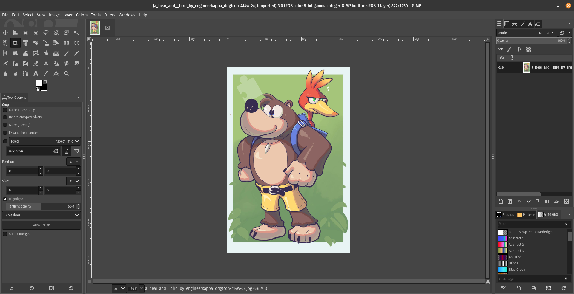
(Credits to a friend of mine for lettig me use the screenshots.)
My ideas on how GIMP can improve it’s UI
-
Adding the option of the new UI selected by default, but with the possibility to switch to the new UI.
-
Possibly addding “work spaces” like Krita would help too, along with the possibility of exporting and importing them, this way people can have custom arrangements of the UI according to the kind of work they will do.
Thanks for reading and hopefully we can address this issue effectively.
It’s not what the buttons look like, it’s what they do. In Krita, making an ellipse involves clicking the ellipse button and dragging it somewhere. You now have an ellipse, and you hold shift if you want to make it a circle instead.
In GIMP there is no direct ellipse tool, there’s only an ellipse select tool, likewise you hold shift to make it a circle. Then you use a menu item to select the border of your selection, getting a popup to let you determine how much pixels you want. And then, you use the fill tool or fill menu item to fill it. That’s a surprising amount of clicks to accomplish what’s most likely the single most common task for anyone opening a screenshot in an image editor. I’m not aware of any easier/faster method to do it. Feels like it should exist, but this is also what you get if you search for how to draw a circle in GIMP, so if it exists everyone’s missing it.
GIMP’s method gives you more power, but you rarely ever need that power. But when you do, Krita also has ellipse select, border select and various fill tools that can be strung together in the same way.
Small comment on that: after I discovered greenshot on windows, I have never needed to open the screenshot again to edit it, because it already does all these simple tasks right after taking a screenshot.
Hm, yeah, i never used the Elipse tool, i guess yeah, that should give the advance settings as an option, but going simple should be first, wish we could reach out the devs, but it’s not an easy task. :/
You seem to have a pretty big monitor. Try it on a 13” laptop and you’ll see why it’s harder to use.
You can press the TAB button to temporarily hide all menus. It helps when working on small screens.
Which isn’t as easy as having the tools right there.
You can click the tool, configure it, then hit tab to work on the image. Then tab again to click on the new tool, tab, work on the image. It’s a nice and simple workflow. I don’t know what to tell you, it’s not rocket surgery. I mean, you’re the one trying to do image work on a tiny ass screen. I’m giving you a neat trick that worked perfectly for me. Sorry it is not good enough for you, I guess.
I hear you. And I use that for many situations. All I’m saying is most complaints likely come from users with small screens and the fact that the default tool setup is so large makes it hard.
UI is dated, for one.
range inputs can’t be scrolled, dragged around the screen, and are absurdly small on high DPI screens.
There’s a load of UX issues, such as how pasting content will create a new layer that is for some reason more limited than a typical layer.
Feature discoverability is poor. Most features are buried in years-old dropdown tabs that aren’t kept up to date with UI/UX expectations.
Some features are incredibly obtuse in how they explain themselves: selecting a brush dynamic selects stuff from a massive scrolling list with nothing but a title to explain what they do.
UI is inconsistent. Some elements are clearly older than others even after ““recent”” (years-old) updates.
There’s way more, btw. But honestly if this years-long push to get GIMP to GTK 3 has told me anything, it’s that the project should’ve canned the update years ago and written an entirely new app from scratch, dropping the technical debt, the archaic choice of language and UI toolkit, and they still would’ve come out with a new version faster than they have now.
How would writing an entire program be faster than upgrading an already fully functioning one ? I don’t see the logic ?
Because the underlying dependencies of GIMP changed a lot, especially between GTK2 and GTK3. It pulls resources from writing code to figuring out how to migrate code to a new version, usually as changes in the toolkit mean you may have to rewrite stuff anyway, which can mean more bugs or regressions in functionality which must be addressed.
Writing from scratch, you can write code that immediately fulfills the spec you’re working to (They could’ve even skipped straight to GTK4!) and used the old code as a reference of what’s needed for users whilst throwing out anything and everything else that isn’t strictly necessary.
It allows you to throw out old features and code that you had to work with in the past, but may not actually be used by anyone. If it WAS needed, it can be added later.
Most importantly, there’s little to no expectation that the new app will supersede the old one immediately, whereas during a toolkit migration you need to keep everything working for every release you do.
It’s like how building a new house can be faster than renovating an old historically-protected building to the same regulatory standard. There’s red tape, you have to work around old masonry and brickwork, you have to avoid damaging the building and keep its appearance the same. A new house may be different in looks and miss the old charm or familiarity, but it’ll be built faster, cheaper, and for the same price have more features to the old building.
I see ! couldn’t development be done in a separate branch with no expectation of an immediate release ?
Probably in a similar way to how USA and Canada are stuck with a two party government system and any attempts to remedy that haven’t been working out, but maybe if the country collapses under its own stupidity and the ultra wealthy run off with all the resources then the remaining people can struggle to survive with nothing left and die then… Oh wait…
As others have mentioned, it’s simple things takes alot time finding/figuring out.
I use GIMP within Ubuntu MATE few times a week to edit pictures. Simple edits nothing major.
One of the thing I need regularly is to highlight certain part of the picture.
Now in Microsoft Paint I can draw a rectangle, choose its border thickness, and color in 2 seconds.
I have learned how to do the same in GIMP few times but it took alot of time and I still forgets after few weeks.
So now I just reboot the PC and log into Windows or use Windows virtual machine and draw rectangle in 2 seconds in Microsoft Paint.
Mine is extremely simple use case, so I can only guess how difficult or how time consuming it would be for actual professional to create artistic work in GIMP vs Photoshop (or in similar commercial software).
Just my 2 cents.
This sounds a lot like how people would use windows paint for simple things over photoshop. Many folks just want a simplified tool. I was estatic to find out firefox now gives simple pdf editing capabilities instead of me importing it into libre office draw.
I guess i am so used to the layout i barely have a problem, but finding things in GIMP, isn’t it the same as Photoshop? I mean, maybe not for Krita, but in GIMP you can change the settings so the tools are all visible instead of being on little boxes.
Im not sure but im guessing most people complain because they want something intuitive and easy although my wife uses photoshop and I could not get her to use gimp so the layout must be different to some degree.
You can modify the UI to make it look like Photoshop, there are two ways for this:
-
Making GIMP look like Photoshop CC 2020 by Davis Media Design https://youtu.be/dY7g2JGyJeQ?si=AQ3uYQxHb7uG0xd3
-
Installing the PhotoGIMP addon for GIMP, also by Davis Media Design https://youtu.be/57DNUsf4A-0?si=XSCZhf_6rf4k25qx
I would personally recommend the first one, but it’s up to you.
thing is I don’t use photoshop. my wife does. its hard to explain her personality but im not using any convincing chips on this particular battle as we have more important things to get handled. Maybe someday.
Well, here’s one final advice from my part.
Go slow and gradual
Changes are not easy, you need to get hang of GIMP before makig the switch, try it, learn to use it, see if you like it.
Another alternative is Photopea, but it’s propietary and it’s a browser application, although it’s available in Flathub.
-
GIMP feels non-intuitive sometimes.
For example, layers.
I expect that GIMP internally has a list of all objects that I added to the file. Like, text, brush drawings, pasted images. Instead, I cannot find that list anywhere.
That list is either the undo-menu or the layers themselves, as everything you do in GIMP is somewhat destructive. This behavior will be changed in GIMP 3 tho.
Yeah, good to know. today I learned …
deleted by creator
Krita lacks a lot of tools to work with photography. It’s OK with general image manipulation but you have to really struggle to do anything that’s not digital painting.
That said. The left side of GIMP is wide because the tool options are under the tool’s icons. While Krita has them on the top as a bar.
Both programs let you move and change the layout to whatever you want, though. No one serious about using either program uses the default. There’s a bunch of stuff you don’t need to use that only takes up space when you’re just doing one particular task. Hence why saving and reloading layouts is such a powerful feature.
EDIT: Here is, for example, my layout.
Also, the little logo on the corner has a purpose. It’s a small area where you can drag and drop any image file from your file explorer and it will automatically open the file for editing, instead of pasting it on the current open project as a new layer. It’s super useful.
deleted by creator
It’s there for convenience. Easy is a very subjective term in this context. Everyone has a different concept of what is easy on a computer. The fact that drag and drop has two, completely differentiated but equally instantly available verbs, is already above and beyond the amount of options other software packages offer.
Hey look, voilá, this is entirely possible
You know you can change the UI and Keybinds to make it more alike to Photoshop, right?
It doesn’t scale properly on my HiDPI laptop display, which I use at 200% scale (Plasma 6, Wayland). Some things are too big and others too small. Hopefully GIMP 3 will bring good scaling support with GTK 3. Still, I love GIMP and will continue to use it over any alternatives.
Same deal here. Text is too big, tool icons are just about right, brushes and patterns are microscopic.
This actually makes sense, have you tried reporting this to the devs?
It will be fixed in GIMP 3, the current stable release uses GTK 2 (doesn’t supoort Wayland natively).
Let’s hope so, i’m not a Linux user yet, but i am CRAVING for the day GIMP 3.0 launches at last, it’s a great software along with Krita, Blender, Kdenlive, Inkscape and Godot engine.
All I want is to GIMP to save tabs layout as workspaces. That is enough. Part of GIMP hate is based on 15 year old complaints. Just like people still complains today about stuff of Linux that has been resolved for decades. It’s just memery that has stuck around.
There are issues with GIMP, but none are about the stuff most people meme about in social media. Every tool has room to grow, but GIMP UI suffers from the “too amateur to know what’s wrong” loud majority effect. Imagine someone who has no concept of music appreciation in their lives sits at the front of a grand organ. Then proceeds to complain that the pedals get in the way of sitting on the stool and that he founds the three keyboards redundant and unintuitive. This notion is valid, from his point of view. But it informs nothing about the usability of that particular instrument for a professional organ player.
The same thing tends to happen with several software packages, specially the open source ones. Since they don’t have the industry standard tag, they don’t get any leniency when it comes to learning their features and capabilities. Then, when the amateur checks them out, they don’t compare it to the industry standard (which does have a leniency license) but compare it to the simplified, accessible for everyone and strip down apps. These people don’t have the foresight to understand that this tool is capable of way more than their reference point, and the initial friction is an indicator of their inexperience, not of the tool’s quality or potential.
The amateur is more comfortable sitting in front of a Casio learner piano. And we shouldn’t lend much credence to their feedback about the ergonomics or key feel of a Steinway concert grand.
Because updating dependencies after a long time breaks most of that code anyway, so you have to do a lot of work just to get things working exactly how they were before, only now your code probably has a bunch more bugs that you now have to fix, and it’s still not utilising enhanced features that updated dependencies may offer.
Rewriting can take more time, but if your alternative is to slowly upgrade code originally written in the nineties, you’re actually saving time by using your experience to rewrite something.
How about installing Flatpak instead of .deb packages?
Flatpak has all the dependencies self-contained within the program, so it should work a lot better
That’s different to how dependencies are managed when developing an application. When they’re updating GIMP and updating it from GTK3 to GTK4, they have to upgrade a bunch of old code that was meticulously fixed to work with GTK3, and things may be changed, broken, or missing entirely. That’s the kind of work you need to do when upgrading an app versus writing a new one from scratch :)
Does GIMP even scale with monitor ratios? That was a huge problem last time I tried it. It’s a 4k world out there.
I cannot answer you that, i don’t have a 4k monitor and i’m not filthy rich to get one, this is latin america my dude.
deleted by creator
To pick one example: Shift + Middle-click used to be free zoom, but is now rotation. This is not just frustrating - it’s nauseating. I have a very strong stomach. I don’t get seasick, I don’t get VR-sick, I don’t get regular sick. The last time I threw up involved food poisoning on another continent. But god damn, is it unpleasant having your whole perspective spin while trying to get a little closer to an image.
I asked one of the GIMP devs about this on reddit and was told it was impossible to make optional. Got some genuine ass-ache for pushing against the idea that anything was impossible, in software, especially when the desired functionality could just be… not. A checkbox would suffice instead of arbitrary reconfiguration. I’d be okay with the mess of arbitrary changes since GIMP 1.6 or whatever I’d been rocking, if one of the central adjustments hadn’t been reconfigured to make me physically ill.
I like it