
You must log in or register to comment.
Y’all are all fucking up. This is a raw survival chart. This is not a save the planet chart. This is a capitalism has fucked me, how can I best spend my negative money to eat chart, and it is spot on. Eggs all day if you can afford it, and those dirt nasty bad boy legumes if we’re willing and able to cook a good meal. Well done.
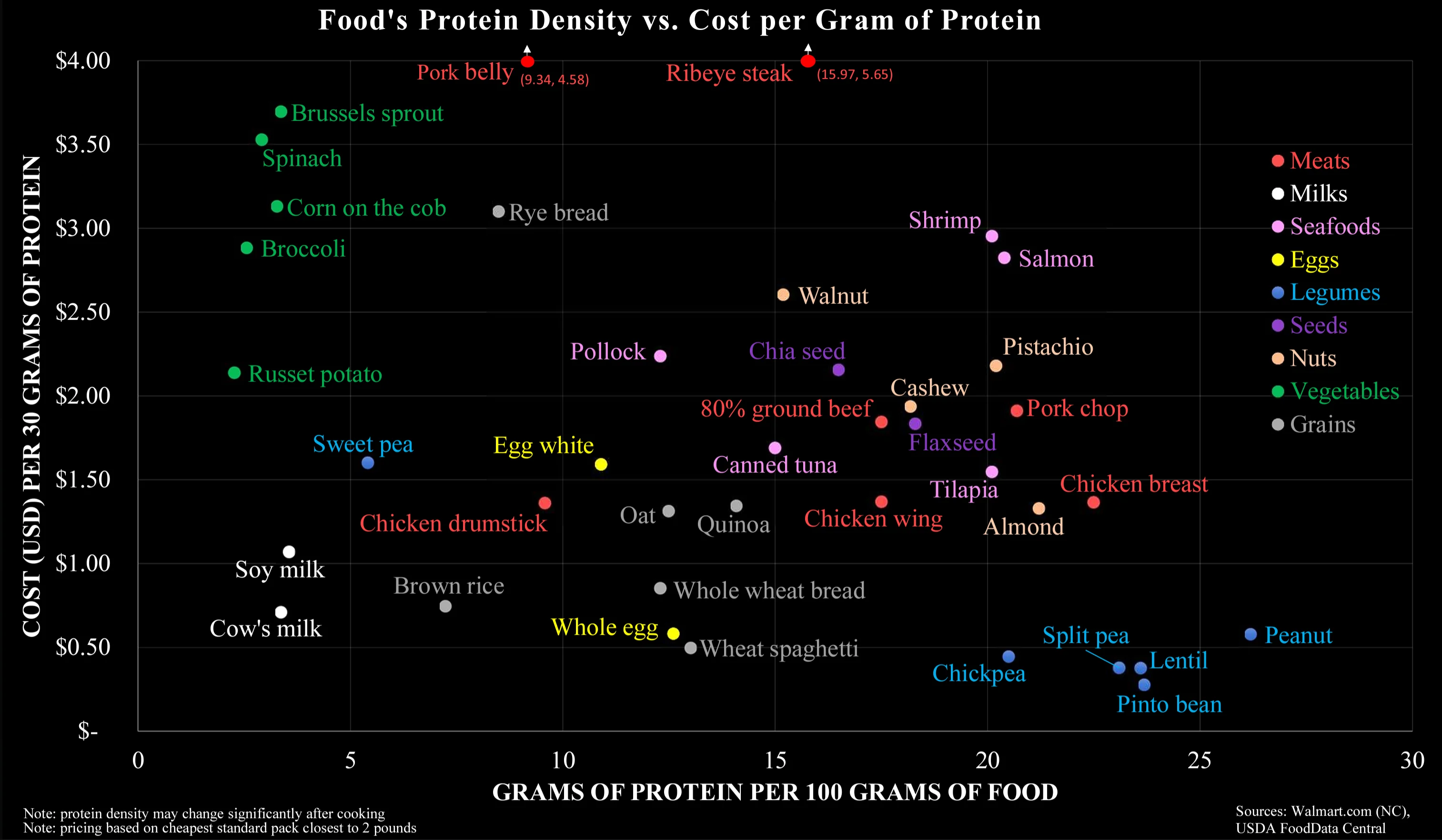
Yeah, I interpreted it as such, which made me even more confused there’s only milk and no other dairy products. Here in Germany at least, if protein for cheap is what you want, you go with Quark or Harzer.
EDIT: Huh, I just did some very rough math in my head, going with 1,35€ for a 500g pack of Quark from Lidl, and interestingly, that seems to put it roughly at the same place as actual milk, with it having 60g of protein, that is fascinating.
If you can afford food, its ok to just take it.
I am a little thrown off by there being no cheeses and other dairy products at all. How does stuff like Skyr, Yoghurt, Quark, etc. compare?

1+ for Anya!
The Y axis is throwing me off a bit. If the X axis already shows the amount of protein per mass, why would you also couple the Y axis to the amount of protein? So all the products low on the X axis automatically increase along the Y axis. For example, the vegetables are probably that costly in this graph because they have a low protein content, not because they are necessarily that expensive.
I assume this chart is intended for people making an effort to eat as much protein as possible for as cheap as possible, I.e. bodybuilders, powerlifters, and the like. In that case you would want to avoid vegetables because of their low protein regardless of how much they actually cost, so the cost per gram of protein is actually more useful.
In fairness I may be reading too much into it; nothing about the chart actually specifies who it’s for.
Fair point, I guess this would be a good reason to plot it like this. Maybe the author of the graph should have labeled it accordingly to avoid confusion though…
There are some applications that require normalizing an axis by the measured variable, usually just to make something linear. Not sure what the reason here would be.
Egg superiority.
It’s pinto beans, ese
Peanuts, BOYEE!
Yeah pero you’re talking protein for your peso, and I’m talking protein for your dinero hombre.
Peanuts should be at the top of the chart not the bottom, those things are fucking expensive.
I think this is probably including unsalted roasted whole peanuts in the shell. They are pretty cheap to buy in big bulk bags. If you want pre-shelled roasted, salted, or seasoned peanuts, you will pay extra for it.
Unsalted in the shell is what I was talking about, I guess its a regional thing. The UK isn’t even close to anywhere they can grow so they’re really expensive here.
- 1 lbs unsalted peanuts in the shell - $2.50
- 1 lbs unsalted shelled peanuts - $2.60
- 1 lbs peanut butter (just ground peanuts) - $2.30
This is US, but just in awe you were wondering what the difference is for us. I’m actually pretty shocked the prices are so close together no matter the form.
Peanuts are cheap in the US. There’s always peanut butter too, which despite the processing required is probably even cheaper, maybe because of shelf stability and packing density.
Beans ftw
Peanut
I have found myself going back to legumes for my diet due to the cost efficiency.
Where’s broccoli?
Probably at the dot marked “Broccoli”
Oh woops, I’m on mobile and didn’t see it
I figured it was something like that. :)
This is the weirdest star map I’ve ever seen.
They could be halfway across the store by now
Hm… this doesn’t exactly make sense - pork is normally cheaper than steak. Or maybe where I live, this is the case?
Also salmon is close to ribeye (protein content) but has far less fat than ribeye. Surprised sirloin steak isn’t in there which is normally more expensive than ribeye.
So much wrong about this chart. It is factually correct, but it answers the wrong question.
This chart makes it way too easy to optimise for cheap protein, which is misleading. It is not this what it takes to have a healthy organism. It takes a varied diet, with balanced quantities of liquids (see milk), vitamins (see sprouts), fatty acids (see salmon), minerals (see shrimps, eggs, walnuts), actually carbs (potatoes, rice, spaghetti), and much more…
Most crucially, the graph is an oversimplification of protein content. Legumes do not contain the full amino acid chain unlike meat. Non-meats need to be evaluated with the nuance of its nutrients not necessarily being as bio-available for human digestion. Carrots and Vitamin A, for example.
I’ve had to debunk this myth multiple times in this post already, I’m not sure who started it. Legumes do have all the aminos and in sufficient amounts.
Also on bioavailability, it is a double edged sword. For example heme uptake is greater than mineral iron, but your body has very little control with inhibiting uptake when you already have adequate levels. With the mineral form your body has various ways to promote or inhibit uptake. The same is true of your example of vitamin A. You can pretty much eat as many carrots as you want and suffer no ill effects, eating too much liver or taking too many liver oil supplements however can lead to poisoning.
Thank you for saying this. The PDCAAS shows the digestible properties of different protein sources. It would be a good multiplicative factor for the X-Axis to make the sources comparable, since Cow’s Milk, Chicken, Egg, Whey, Casein, Tuna and Soy Protein (Isolate) have a score of 1 while Lentils, Tofu, Rice and Wheat have roughly 0,5.
That means you need to eat (and buy and cook) twice the amount of the latter to gain roughly the amount of actionable protein of the former.
Lmao you don’t need any animals or their secretions in your diet to be healthy.
Your seem to insist to twist this towards vegan wars, but this is you. It’s not the graphics, it’s not me.
There is no conflict here and no war. You made the false claim that for a balanced diet, animal parts are required. I corrected you, that’s it.
I guess you misunderstood my providing illustrative examples in parentheses. Replace or remove the examples, the argument is still valid.
In another subthread they’ve pointed out that processing food also changes its protein density, most obviously by water transfer.
Animal liquid somehow turns into gastrointestinal distress for me, and like 60% of the world. Maybe the diarrhea argument would help. Wield it carefully.


