
Can someone please Photoshop it and fix the keming
keming
kerning
FTFY.
That indeed is the joke, yes
Dammit lmao the joke has stuck so hard I forget which one is the real one.
Ok that’s hilarious.
In a few decades maybe it’ll officially be “keming”
But still pronounced “kern-ing” and no one knows why

Thank you
Huh. Weird. You made that comment. I didn’t. sometimes my Lemmy glitches after I leave a comment it does things like this to me:

instead of posting my comment, it posts my username over somebody else’s comment 🤔 It’s a temporary glitch and It fixes itself after I exit then come back. I captured that screenshot to get evidence of the glitch before it fixed itself.
… Hahahha?! You should contact the app developer thats silly and weird
You’re right. I should report this glitch. This is the first time I’ve been able to catch it and put it into words.
there are a few glitchy things about this app but those of us who are loyal to it are loyal suckers for sure.
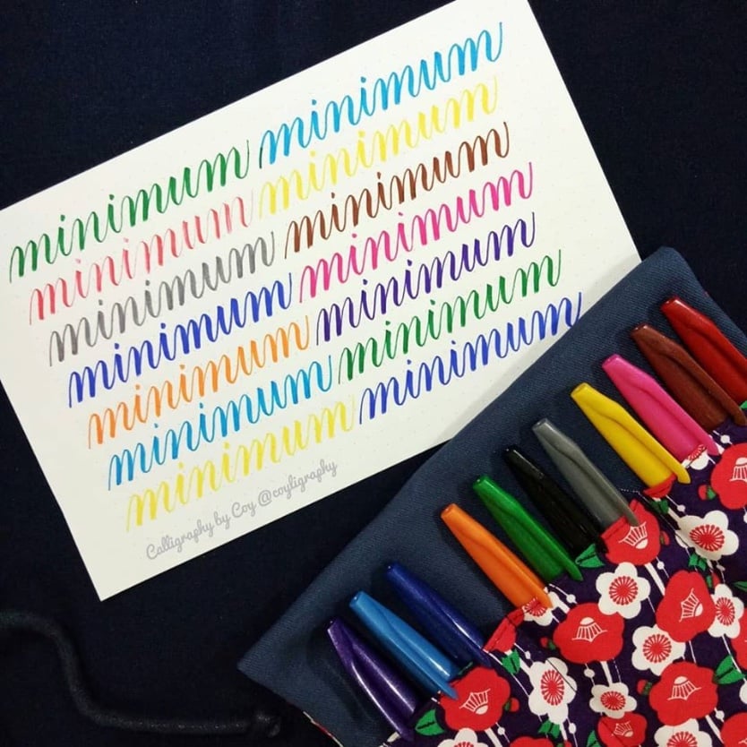
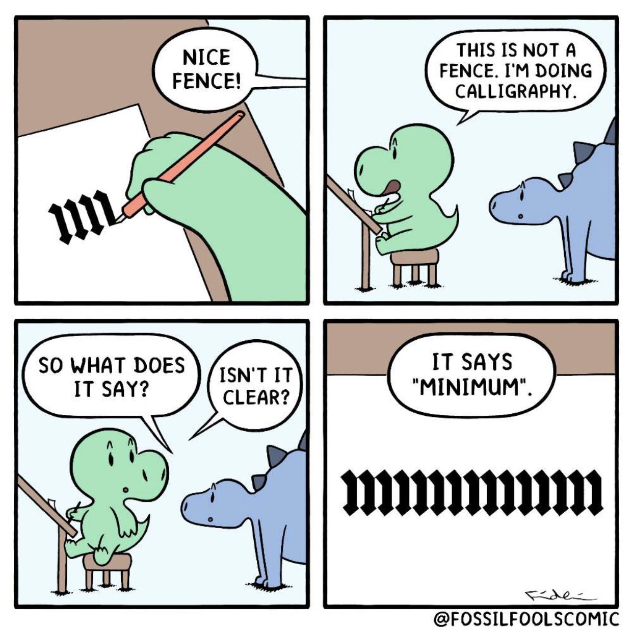
I’m pretty sure there is an extra “picket”.
Edit: I may be wrong, but I don’t know enough about calligraphy to be sure.

I did it on my phone, so it’s not great. But it might help show the letters.
It’s great thank you
No, there’s not. I Zoomed in and scrolled it one letter at a time. It’s the right number of pickets for minimum. It’s just a horrible, horrible mind fuck. Lol
This is actually a thing. When learning calligraphy, it was one of the exercises we did. If you have good enough control of your hand and pen, then all strokes should be the same length, slanted the same way, and separated by the same spacing. When you manage this apparent “unreadable” thing, it means you nailed it!
The example below comes from this site (not mine)
The first thing that popped into my head when I saw that “fence” is Tengwar:

The elves must really hate dyslexics
the first thing that popped into my head was Russian cursive.
Ha, true, it can be almost as hairy as Tengwar especially if you write nonsense. Quick, name all the letters:

edit: made it worse
revenge of the edit: “minimum” isn’t exactly easy to read either:

Cursive и being written like a u is just… ugh
At least shapewise it’s like close-ish; the one that really gets my goat is how the fuck does т turn into m.
Keming is a bitch.
/s
Well played
Actually it says mmmiinu
Do they not dot their i’s in calligraphy?
лишишь
Also nice the calligraphy used in Germany until 1941, the Sütterlinschrift

But one of the best is arabic calligraphy (I think that I can even read it ¬¬)
New metal band font dropped.
Russian cursive
mrnmrnm
For a second there, I saw it. Now it’s just a fence again.
eschew obfuscation
Isn’t it clear?
No. :)
It’s a pretty obsolete hobby, as we have computers and printers that can do the exact same thing in a fraction of the time. I know people do it as an art form, which is fine I guess, though you’re not gonna sell prints, get published, or end up in a museum no matter how good you are at it.
You do hobbies for fun, not making money, that’s a job.
Yes, also painters are obsolete, because AI permits even Cletus to be an artist
Hobbies don’t become obsolete dummy
But obsolete jobs do become hobbies.
The money in calligraphy is usually made on wedding invitations, diplomas, “fine fining” menus, and corporate award certificates


