
Hey everyone.]
So update 98/99 has gone live which fixes the crashes (thanks for the reports).
I’m gearing up for a pretty sizable release but just wanted to check in and ask if there was any issues you’re having that I should know about or any new feature requests.
Sorry for the bad comms but I’m making my way through lots of messages and posts on here. Thanks for the patience as I get through these all.
Cheers, Lj
You must log in or # to comment.
I’m partly colorblind and it’s super hard for me to see when I upvoted or downvoted a post. Just making the up or down arrow bolder (or circled) once it’s been clicked would fix the issue completely for me and all types of colorblind people.
Thank you for the great work 💛
Can i ask if you meant to put a yellow heart or did you thought you were putting a red one ?
It’s blue, you plonker
You too ? Or is it me ?
Yellow is very visible, it was intentional but with no specific purpose :) There are multiple types of color blindness but all of them will be aggravated if a font or shape is thin or just outlined (which is not the case with a filled in heart emoji)
Yellow is actually quite normally visible for most colorblind people. Blue is as well, interestingly.
The most typical type of colorblindness involves inability to distinguish between red and green.
Is there a particular significance of a yellow one?
Edit: oh dammit I just got it.
Added support for the next release to change the colors.
Doesn’t really help when in grayscale mode on Android.
Which view type are you using?
I’m not sure where to find which one I’m using. I use dark mode and the colors I’m having trouble with if the font is too thin or small are the orange and light blue. Changing the font weight or adding another style would also mean this is visible in night mode on Android (which removes all colors)
Edit : I investigated the viewtypes and they all have the same issue of using the same font size and weight, just using the orange/blue color for the number of upvotes and the selected arrow.
Edit 2 : increasing brightness helps a lot with the colors, but I’m mostly using Sync at night on minimum brightness.
The best way for you to visualize the issue would be to activate black and white night mode on Android :)
Thanks for the update.
Would allowing setting a custom color help?
Not sure how I would use that. Do you mean 2 custom colors to change both the default orange and blue? I can perfectly distinguish them when they’re on a bolder shape (🟠🔵), it’s just a lot harder (or sometimes impossible) on a thin line/symbol.
Again, the most efficient way to handle it would be to have a different style for the selected arrow (bolder, bigger, underlined or circled for example), on top of its color. It would then work as well in bedtime mode (b/w and low brightness) for everyone, not just for color blind people :)
I think bedtime mode activates by default on newer Android devices after 10pm when the phone is charging. That’s how mine (OnePlus) was set up.
I see my initial reply was upvoted about 30 times. Statistically speaking, I don’t think these would be only from color blind people
Changing default sort to hot does not stick for me.
Redgifs is broken (as is tradition) ¯\_(ツ)_/¯
Device information
Sync version: v23.11.29-22:27 Sync flavor: googlePlay Ultra user: false View type: Slides Push enabled: false Device: bluejay Model: Google Pixel 6a Android: 14Fix for redgifs is going live now.
Settings > Account settings > post sort?
You’re not gonna believe this man, but you can actually directly link to the setting ;)
How?
By long pressing the option the link gets copied to your clipboard.
Sweet. That’s really good to know
deleted by creator
I can set it there but visiting my instance or my subscribed it still always sort by active instead of what I have set
Edit: I just notice that there is a save button . It works, when I save 😉
Did you change it here?
Settings > Account settings
Yeah, my problem was in just overlooking the save button at the top right of that page. Maybe a reminder if you leave without saving would help or make it autosave when a setting is changed.
Just chiming in to say thanks for the update and all the hard work!
I’m eagerly waiting for separate upvote and downvote counters 😼 but let me know if you were only asking for features not discussed previously to shut up next time
I have a feature request. Harmonic for hackernews has the option to open a url directly on archive.org, which I think is a pretty neat feature. Would it be possible to add this?
How would that work exactly?
Like this link https://google.com would open https://archive.org/details/google.com ?
Is there a way to make “deleted by user” stand out more as a system message? The current styling makes it look like they literally commented “deleted by user”
Good to see you’re still alive! Looking forward to future updates and improvements.
Just wanted to say thanks for the post, even if it was a quick one to say releases are coming. I had been considering signing up for your paid version but was hesitant to pull the trigger because I feared the project had been abandoned. Since it’s not, I’m signing up now. Appreciate all the work you put into the app!
The only bug I’m having with Sync for Lemmy is that it does lots of wakelocks in the background, I had to set the app to restricted mode in the battery settings as a workaround.
I don’t know if this is because it tries to fetch notifications (a feature not available yet) or IDK.
Setting it up to “restricted” instead of “optimized” basically fixes idle issues, although I can see the app refresh a lot more than when it is optimized…
Sync for Reddit never had this issue, I always had it in optimized mode and it barely was active in the background.
Pictures for reference:


EDIT: I am experiencing this issue with AOSP, with MIUI I did not, but I’m guessing it is only because MIUI is more aggressive with apps in the background.
EDIT 2: Also I’m seeing a new gap just below the main post in the newest version 😅
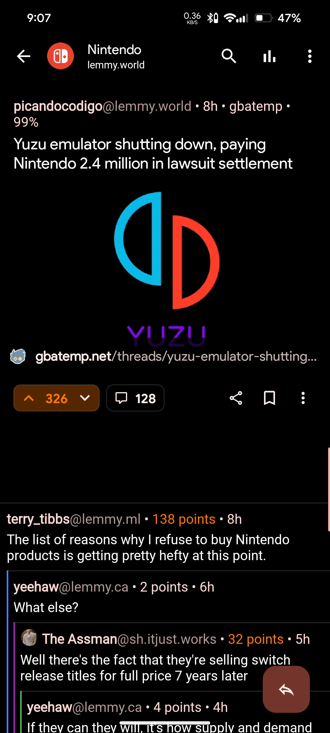
I also noticed a gap, and I’m wondering if it’s where the ad banner is now. I really hope not and that this is just a visual bug, because it’s pretty glaring and distracting.
Sadly I just corroborated it, and yeah, it is an ad :/
Hopefully dev will get rid of it, I think it was enough with the ads in the main feed.
Even Boost ads are not that distracting.
Nothing to report or add, I just appreciate you!
(シ_ _)シ
Thank you for making this app 💜💜💜
In Sync for Reddit we had the ability to view previously upvoted posts. I don’t know if Lemmy supports that, but that was a feature I used often to go back to something. Thanks
Can we have the swipe mode for pictures that we used to have in Sync for Reddit?
I second this. It is the option in the three dots when viewing a stream of posts, right? I recall it had the icon of a finger and and arrow and was called “Swipe mode”.
Features wise, full mod tools would be awesome, but I figure you’ve got that on the list already. Same with the latest lemmy stuff like instance blocking at the account level.
Beyond that, the only thing I can think of is more granular control over theming. I finally found a set-up that’s working for me, but I know it took some fiddling that could have taken less time if I had been able to tweak background colors, or whatever. I’ve seen other people talk about that for sync, as well as other apps that a don’t even have the options sync does. From a usability perspective, contrast between sections of the ui can be the difference between literal headaches and a relaxing scroll.
But, again, that’s pretty low priority imo.
Images like the one in this post don’t automatically open at full resolution. There’s a discussion in the comments about the steps to get it to open at full resolution.
Seems to work for me. Seems to display the higher resolution in a mosaic. As I zoom I can see the text sharpen.
I get a really low resolution version unless I follow that work around that someone suggested on the thread.
Works for me
Clicking on the image and zooming in works no?
Well this is weird. When I’ve gone on it again it loads at full resolution and I can zoom in fine. When I was opening it yesterday it seemed like it was just opening the thumbnail.
Whenever that happens to me backing out and reloading the post once or twice will load in the full res one.
Sometimes large images seem to load a lower resolution image and you have to click out and click again for it to load. Usually I notice it when peeking.
Peeking loads a lower resolution one. You have to click to open it fully to load the full resolution version.
What about actually tapping the image?
Edit:the post above loads the lower res one for me when I just tried opening it. Going back again brought up the full image.
Tapping will load the preview for the animation and then the full one after. Could have been a network issue?
Which animation? Like from low res to full?
Yes just while the image is opening.