

My wife just reminded me that she was asked to take a survey about this car after she bought it.
She complained about these buttons being oriented stupidly, and the survey taker mentioned that this has been a common complaint for years. Nevertheless, BMW / Mini has stayed the course. Users be damned.
Begs the question - what exactly is the survey for, then?
probably crowd sourcing tests for more critical errors.
“did your car suddenly stop while going at 90 mph?”
“When was the last time your car spontaneously combusted? Please rate the level of inconvenience.”
“Mmmyes, quite, I was mildly peeved, rather. My Tom Ford blazer was singed on the lapel, it took the cleaners a week to remove the soot. A week! Also, I am just a tinge dead.”
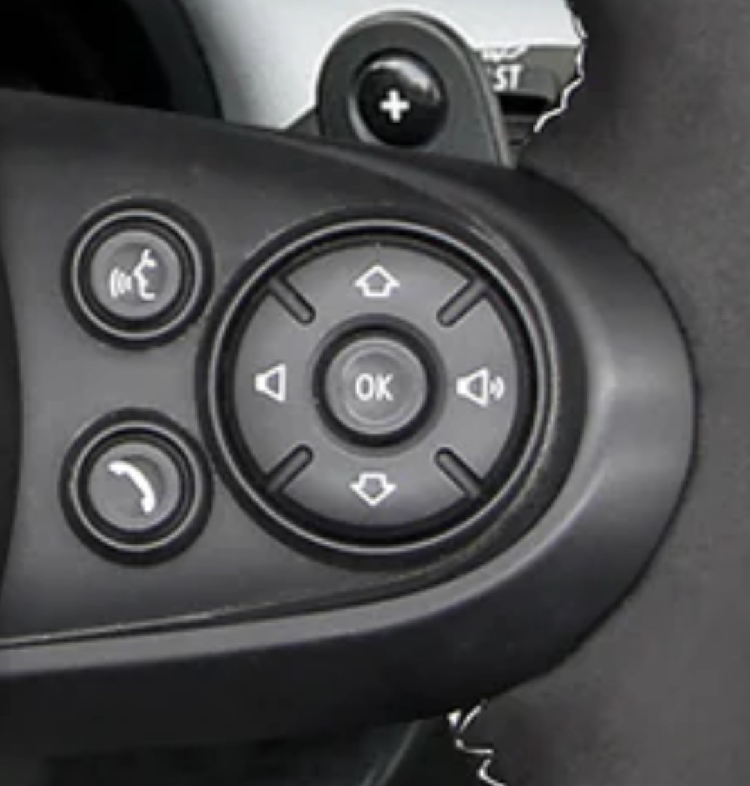
The speak-button looks like a farting stick-figure.
Ampersands on Lemmy, mildly infuriating
&ersands*
Fixed. It was appearing correctly in Voyager, but not in the OG web client.
I want to know why do many cars don’t have a play/pause button on the wheel, but do have a source button.
I change my source from my phone exactly never. I want to pause the audio all the time.
bro I swear whoever designs the interfaces in cars must be the CEO’s nephew
My Hundyai has a programmable star button on the steering wheel that can be tied to media on/off.
Kia also.
I’ve been wishing for play pause since audio books and podcasts came into the world. It’s ridiculous that nobody has this button in 2024
deleted by creator
I change the source regularly between my phone and the radio, but I don’t use any of the wheel buttons, so I’m not even sure if my car has a source button on it.
Drove a Kia once and it was the same. Up went back a track, down went forwards. Opposite of my intuition.
Those directions make sense to me. If I view a playlist on my phone or PC, it runs top to bottom and skipping a track goes down the list.
If they’re on a wheel with volume then volume should absolutely be up/down and next/back be right/left, though.
Hyundai is the same, even on current models.
I have a Hyundai and this is not the case. Maybe it’s regional.
My 2023 sonata has up for back and down for forward, which I don’t hate. It also has a separate up/down switch for the volume though, not right and left like OP’s.
Current Kia isn’t like this
Yet one more item in an endless exhibit of how mankind is unable to standardize anything at all. Get TWO engineers together to agree on ONE standard plug and the assholes will come out with THREE separate plugs, completely non-compatible with each other, of course.
It’s almost like a miracle that we got the world to agree on certain things like time and timezones, a system of coordinates, the metric system.
All of them received initial pushback, and some to this day. Noisy, noisy fucking humans.Did you know that for a few decades, every town in the UK kept two different times on adjacent clocks? Back when their railway grid was expanding everywhere. Local time and London time.
timezones
I beg to differ on that one https://youtu.be/J1kOkoma_hM?si=f7bpphN7fGRk587B
I drove this make of car for a while; there’s an optional head up display where the up and down buttons here let you cycle through contacts/the song queue/radio stations. I’d imagine it’s the same interface without it, just displayed somewhere in the car where you’re not looking while driving.
Having it so that up/down moves you up/down through the list when there’s a visual display is way more intuitive than up/down being volume - frankly the volume bar on Windows, Mac, many TVs etc. goes from left (quiet) to right (loud) anyway
The designer of this layout look at the display, saw that the volume slider was going left/right and placed the buttons accordingly (probably what happened).
This and radio channels/tracks are presented in a list on modern displays. “Down” is the next item.
That is what I imagined as well. Some QA or tester or whatnot probably found it annoying to click left/right when navigating the radio. It does make some sense.
Wouldn’t it be nice if an engineer had decision making power?
Engineer here. It’s like that because that’s the way it’s always been. To change it would mean retooling silk-screen printing on the D-pad, and changing the wiring underneath. And they probably use this D-pad everywhere, so someone like me will have to talk to someone else like me, and right now I have phone shyness (can’t just be an email, have to call a meeting). I’ll also have to talk to a supplier and get them to change the wiring, and Procurement won’t let me just change anything, because it gives suppliers a chance to requote a job, and they’ll ask for more money. And then I’ll have to talk to Production, because they’ll have to retrain the workers, make sure someone doesn’t stop the line because this new part doesn’t look exactly like the old part. Oh, and Quality of course, need to make sure the inspectors don’t start rejecting the new parts (just kidding, they never look at parts). Then there’s Marketing. Since this is a customer-facing part, definitely need their input. Might have to change catalogs and brochures with new pictures.
No, they just got the good brand of gummy bears in the cafeteria, I’m going to go buy a bag of those, and then fill out these forms my new boss has been asking about. New boss, new forms, same old shit.
Sounds like a proper project to me. No wonder companies keep the same stuff for way too long. If it’s not horribly broken and on fire, don’t fix it. Being slightly broken is apparently totally fine though.
deleted by creator
Nothing personal, but that’s bullshit on the company. Rotate the entire assembly 90° to the direction where the next track arrow points right, and counter rotate the ok gel button so that it’s properly up and down. I can’t imagine a silk screen template is that engrained. There might be some mounting screw difference, but adjust that in manufacturing from your parts suppliers. No reengineering of the harness necessary. This is just pure laziness.
that’s the way it’s always been!
Made by people that use a volume slider and swipe for next… Such a horrible design in cars.
The up and down are used to go up and down in menus lists. It matches the animations as well. It would be infuriating if those buttons were on the horizontal.
Hmmm but I think volume up and down, selection left and right are age old. And you shouldn’t look at the screen anyway
For sure, most screens in cars are dangerously implemented. My 2015 Mini has a transparent HUD so I don’t have to look away from the road. No touchscreen either. Long live tactile interfaces in cars.
So what you’re saying is, drivers should take their eyes off the road to look at a list of songs on a screen? Sounds like another horrible design decision.
You don’t have to look at the car’s main media screen. A simplified list UI is replicated onto a small window that temporarily shows up next to the speedometer.
The expectation for everything is to only use the screen when you’re stopped, plus how else would you navigate a menu? Memorize it?
Same in my 2017 Toyota. Bought it new and trained my brain to use it. Someone finally released a replacement that’s set up correctly, and now I’m relearning the control.
Yeah that was one of the many things that annoyed me in pre-2020 Toyotas, along with the insane baked-in audio delay and the hilariously ridiculous manually-stored images for songs and artists.
Think of it like this. Up arrow is forward and the down arrow is back. The volume then increases from left to right like most linear scales (that aren’t up and down). Yes the buttons should be the other way but there was probably some (poor) reasoning to why they are this way.
As someone mentioned in the comments, it might be because the media is displayed as a vertical list on the car’s display.
Preach! When did you ever hear someone say “please turn the volume right” or “can you play the up track”? It drives (NPI) me crazy in my Toyotas!
So my question is, which is next: up or down?
Down
I was confused first too when my car had the same kind of control for media. It’s completely logical when you take a look on the playlist on your phone.
I believe my Prius is up for next, as in go to the next highest index song.
Both make sense, so in a way neither do
Gen 2 Prius had both left and right, with the volume clearly labeled as up to the right


