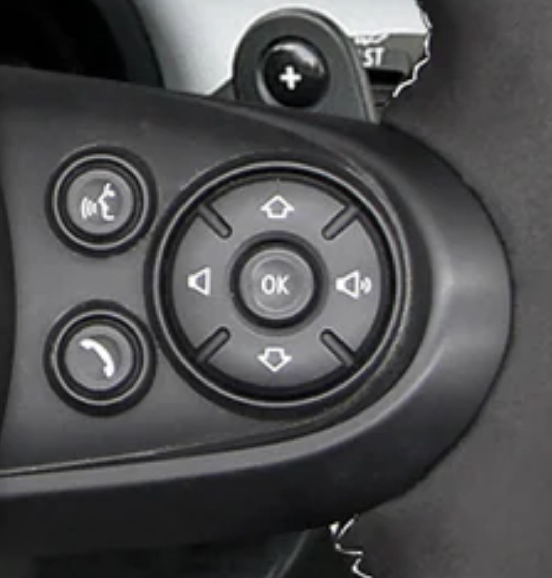
The up and down are used to go up and down in menus lists. It matches the animations as well. It would be infuriating if those buttons were on the horizontal.
For sure, most screens in cars are dangerously implemented. My 2015 Mini has a transparent HUD so I don’t have to look away from the road. No touchscreen either. Long live tactile interfaces in cars.
So what you’re saying is, drivers should take their eyes off the road to look at a list of songs on a screen? Sounds like another horrible design decision.
You don’t have to look at the car’s main media screen. A simplified list UI is replicated onto a small window that temporarily shows up next to the speedometer.


The up and down are used to go up and down in menus lists. It matches the animations as well. It would be infuriating if those buttons were on the horizontal.
Hmmm but I think volume up and down, selection left and right are age old. And you shouldn’t look at the screen anyway
For sure, most screens in cars are dangerously implemented. My 2015 Mini has a transparent HUD so I don’t have to look away from the road. No touchscreen either. Long live tactile interfaces in cars.
So what you’re saying is, drivers should take their eyes off the road to look at a list of songs on a screen? Sounds like another horrible design decision.
You don’t have to look at the car’s main media screen. A simplified list UI is replicated onto a small window that temporarily shows up next to the speedometer.
The expectation for everything is to only use the screen when you’re stopped, plus how else would you navigate a menu? Memorize it?