
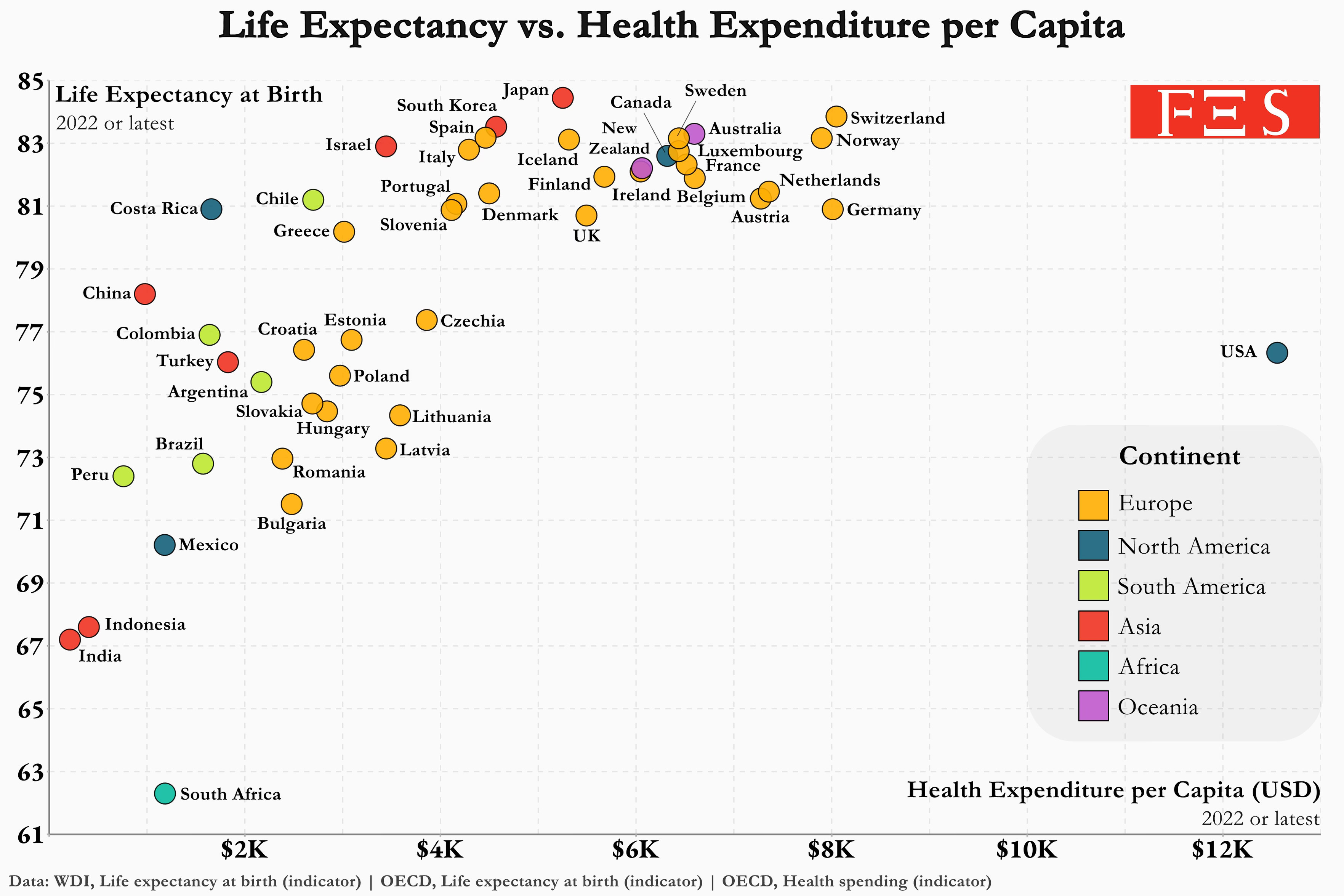
I was wondering where the US was. Then I scrolled to the right.
oh holy shit
Yeah, that’s not a good look. Oof.
Life expectancy as a function of spending is parabolic confirmed? New theory: if you spend more than $22,000 on healthcare per capita, life expectancy will be negative
Hospitals just explicitly kill you and they take all your belongings as payment.
Actually can happen if you’re dark skinned in America. Lots of sketchy cases that happen to struggling folks of dark skin
Take this as a warning, UK.
Your NHS will get even fucking worse and cost three and a half times as much, and somehow a large portion of you stupid fucks are clamoring for US style private insurance rather than making the fucking Tories do their job.
Add Australia to that warning.
Only Denmark has a Beveridge funding model. Most of the places at the top of the chart have a social insurance model (Bismarck).
Ultimately whatever the model, the UK has really low capital investment which is starting to show severely now.
A life expectancy almost as high as China and we only had to spend 13 times the amount of money.
I knew it was bad in the US. I did not know it is THAT bad.
Lots of profits to protect. The lobbying must be intense. Total shitshow.
The lobbying must be intense.
The Sackler family, the shitbags most directly responsible for the opioid epidemic in the US, were handed a sweetheart settlement deal where they had to hand over a small percentage of their multi-billion dollar fortunes and in return they were SHIELDED FROM PROSECUTION on any related charges or civil suits.
Luckily even our shitbag Supreme Court could see what utter scumfuck horseshit that was and tossed the deal out the window and into a garbage bin where it belonged.
Who offered the settlement? Who rejected it?
🇺🇸 #1!one!! Suck it, Cuba, with your nearly free healthcare and higher life expectancy!
Note that pretty much every other country than US in this list, the USD amount is how much the country pays per person in healthcare. Universal healthcare, baby.
So in Finland my healthcare has cost me roughly $10/year.
Not Switzerland’s choice, baby.
where is cuba on the chart
And where’s Taiwan?
Looking like the Japanese have it dialed in, eh?
Not to lump it in South Korea, but Koreans stay active and going out for many more years than other countries.
While the healthcare is good, I’m sure the “not staying at home” is better.
And yet this, too, is driven by terrible political decisions that practically force Americans to drive even the shortest distances. As a European, your cities and towns are extremely aggressive towards pedestrians and cyclists.
And fat shaming is also a normal thing.
Is this data old? India’s life expectancy is now 70+ according to World Bank. Eithercase, I am impressed by China. They had a life expectancy of ~36 years in 1949 when PRC was established. They lagged behind both India and Pakistan for quite some time(cough Mao cough) but then took such a steep climb upwards.
or a great leap forward so to speak 😉
China has gotten better as long as you’re not a Uyghur.
Wild Chaddi spotted !!
I am sorry, but is pointing out data inconsistencies makes you a BJP supporter automatically? Also, the pejorative you used is used for nationalistic Indian supporters who usually, tend NOT to say anything positive about China. I don’t fit your criterion.
deleted by creator
Expenditure on health gives a measure of the final consumption of health goods and services (i.e. current health expenditure). This includes spending by all types of financing arrangements (such as government-based programmes, social insurance and out-of-pocket spending) on medical services and goods, population health and prevention programmes, as well as administration of the health system.
deleted by creator
You’re welcome! You were right to ask.
I’m always delighted to stumble on a wholesome exchange like this. Thank you both!
deleted by creator
So if I pay $10k per year for insurance and the insurance company spends $5k on fixing me then the total is $15k?
If so then doesn’t this paint ls USA in a worse light than it deserves since universally funded countries would only count $5k in this graph.
Further, is that number to include government healthcare funding, as well as out-of-pocket expense, in other words, money spent on behalf of the individual?
I’d like some clarity as this chart on its face is pretty damning.
deleted by creator
What’re they doing in Costa Rica?
Im not sure, but the evidence is worth investigating. Guess Im going to Costa Rica.
Would the graph look slight more narrow if we accounted for median or average country income? Me spending 12k dollars a year in the us is very different than in Mexico, depending on where I get me income from.
To separate the effect of demographic differences from the expenditure, might help to divide by an age-weighted population, rather than simply per capita. Also, is this expenditure converted to US$ in MER or PPP (for services the latter makes more sense)?
Thailand on NHSO: Whatever, just take this paracetamol and shut up. NEXT.
Thailand on Social Security: $25 per month per person forever. Oh, it doesn’t cover mental health or Risperidone or whatever. NEXT.
Thailand on Govt Officer (NOT Govt Employee) Healthcare: How may I be of assistance today milord?
If you want hookers and cocaine you join the USA health insurance corporations
As a South African… damn…
Yeah man… Wtf
This is not a fair comparison. The American medical system has to keep Americans alive while the Spanish medical system merely has to keep Spaniards alive. It is a medical miracle that Americans get to live above the age of 70 on average with their lifestyles.
Same with Italy. The national health-care system barely works, but you know what they say about the Italian lifestyle…
Also, lol I didn’t even noticed USA was there before your comment.


