

The details such as ears, whiskers, nose are way too small. They’re hardly recognisable on a mobile device, app icon wise.
I love the app but the new icon / logo not so much.
100% agree. I really enjoy the app and Kuro has done amazing work, but this logo misses the mark tbh. I’m definitely no graphics designer (just someone who knows enough to make shitty memes), but the alignment is all over the place with this logo.
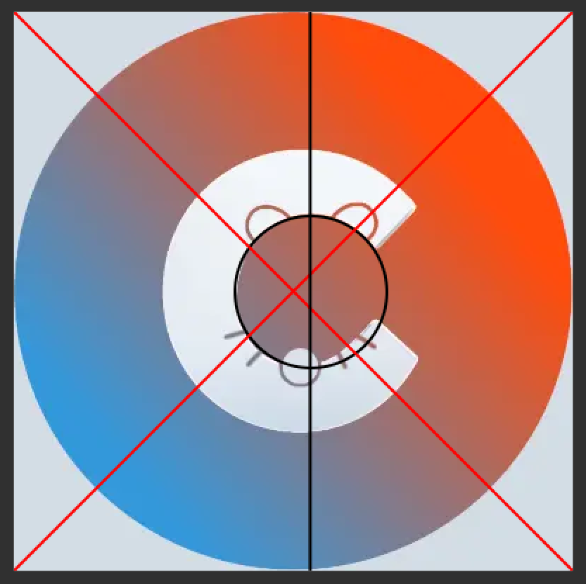
I thought it looked a bit weird when it was more symmetrical but this is another version and I’ll let you judge. (

In my opinion, that’s way better dude.
Haha, this is why I’m not a designer!
Much better, but for the purpose of visibility I think the ears and nose should probably also be cutouts, not edges.
this is better
Thanks for this image, I was thinking the same. I feel like it would work to just put the ears on top of the C. Maybe add a nod to the whiskers with some lines around the edge.
deleted by creator
If it were centered it would be offcenter
Has it really only been two months? It feels like longer.
I agree feels longer. 2 months and 136 releases! (although most of those releases are minor changes).
136 releases! 🤣 That’s true dedication. Thanks so much for your hard work
Still an incredible work. We can’t thank you enough!
I was kind of surprised by the logo after the update, as it looks very similar to the Covid warn app from Germany: https://www.coronawarn.app/de/
The German Covid app logo looks much better than the Canadian one, which is just the Maple leaf being attacked by grey triangles.

💀
I think we are ok. From what I could find, lemmings are not a carrier of COVID-19, thank goodness. (“Lemmings with COVID” are not to be mistaken for “COVID lemmings”. I think that was some anti-vax slang.)
The absolute worst they can host is the bubonic plague, so we are fine. There is nothing quite like a morning bleed out your eyeballs to perk you up!
deleted by creator
Honestly, the old app logo was better. This doesn’t look professional.
The idea is fine, the execution has lots of room for improvement.
Congrats to the best Lemmy app!
Thanks a lot for all the hard work! It’s a really great app I quickly grew fond of.
I think it could do without the mouse, but other than that it looks much much better
It looks like you used the logo to squash a bug
deleted by creator
Congrats and happy birthday! I left Reddit during the blackout and your app made the transition way easier, thank you so much for this. I like the concept behind the new logo and I’m happy to see it evolving in future updates, cheers!
The old one felt like a logo for a high school online assignment submission website
Much better. Older logo looked very… uninspiring.
Congrats, great App and dedication! Boom!
Congratulations! You have done an amazing job on this app. I was running it alongside Sync just to compare and I kept gravitating to Connect. It’s actually better imo. So I removed Sync and use Connect only. Great job! And thank you 🙂🙏
deleted by creator


