

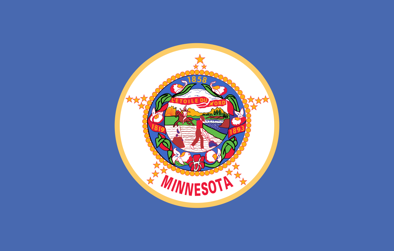
The current flag looks like this, which obviously needs changing:
There is a commission tasked with proposing a new design. A news article about it is available here: https://www.cbsnews.com/minnesota/news/minnesota-house-bill-moves-forward-commission-to-redesign-state-flag-and-seal/
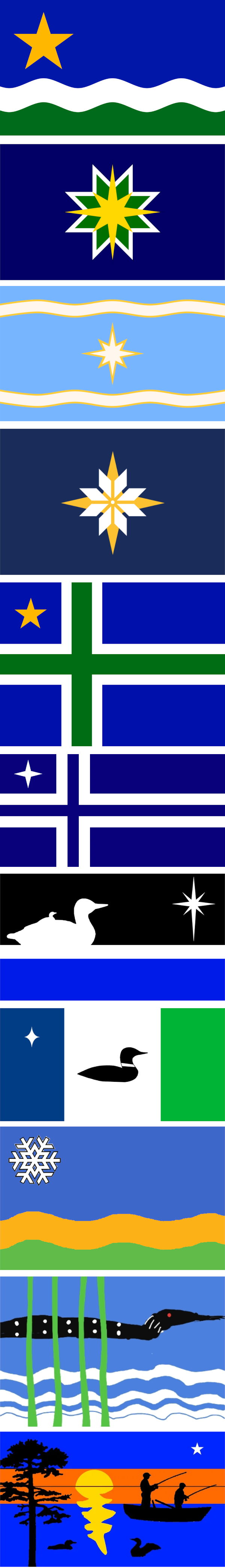
The top proposal, called “The North Star Flag”, seems to be a popular favorite.
I gathered these proposals from these two sites: https://newmnflag.org/designs https://vexillology.fandom.com/wiki/Minnesota
I vote for #10, the 4yr old’s rendition of a Lovecraftian horror.
Is this because they got slagged off by CGP Gray?
If CGP Gray slagging off shite flags gets places to update them then good, maybe he can do transit infrastructure next
Ha! Sadly CGP grey loves his teslas and cars. His video about how self driving cars are the future shows a dystopian idea where pedestrians or cyclists have no space on the roads at all. (And he doesn’t even consider trains or other public transit)
deleted by creator
Highspeed rail in California was way closer but lobbyists and car lovers made progress way and way slower sadly. A good video talking about california high speed rail
Those last 5 are absolutely unhinged and I love them. I think that number 4 is really the best choice though
Seriously what are the stories on those? Surely they were submitted by children or something?
Take it from a Coloradan, get yourself a nice, clean flag design and the merch will sell itself.
1, 5, 4.
I like Nordic Crosses, and the star’s a good color in a good placement. If you want an snowflake star, 4 is the best version.
But 1 emphasizes the rivers!
The fuck are the last two
deleted by creator
I like how the farther down you go on the proposals, the more cooked they get
#4 is my choice. Very clean, it’s an easily recognizable design, and it seems more creative than just “Nordic cross with star” or whatever the abominations in the later half are.
Number five gets my vote. The light blue with a nice star and the swirls , it’s the perfect sign for a flag
Number 10 is the clear winner here. Who wouldn’t want the pancake loon on their flag?
deleted by creator
Minnesota does have an unusually large population with Nordic ancestry. I guess that is the reason for the Nordic cross designs
https://en.wikipedia.org/wiki/Nordic_and_Scandinavian_Americans
I cannot see the name Minnesota without hearing the Norwegian family from the start of Deadwood: “We’re going hooome, too Minnesooootaaaahh”
Not a Minnesotan, but I like the Nordic crosses. Though I have to wonder why there’s no purple in, like, any of the proposals.
Oh look at the royal snob over here with his “why don’t they use purple” nonsense, like it doesn’t cost a year worth of grain and my eldest daughter’s hand in marriage.
Why does it obviously need changing? The new design will be talked about for like aonth…people will love it and hate it, then no one will care again.
Every state whose flag is just the state seal over a blue or white background should be forced to change their flag. The concept is offensively boring.
And caring about a picture on cloth isn’t?
Especially one that only locals see.
Does lemmy have a version of lost redditors? Because you are in the wrong sub.
Because it’s ugly
Beats me, its got five star-cocks surrounding the seal.
- The whole point of a Minnesota flag is to have an easy way to display you’re Minnesotan. Literally half of the state flags look the exact same as ours if there isn’t a wind blowing, and genuinely that number doesn’t go down much even WITH a breeze.
- If we have something more iconic, noticeable at a glance, it’s marketable. Think about Britain’s flag on all their tourist merch. Think about the MOA star on everything to do with the mall, think “I <3 NYU” mugs, shirts, hats.
Number two or four.
Really disappointed in lack of laser beams coming from the bird eyes.
The current flag is ahhh, pretty bad. Like its just awful looking, and the native american racism too.


