
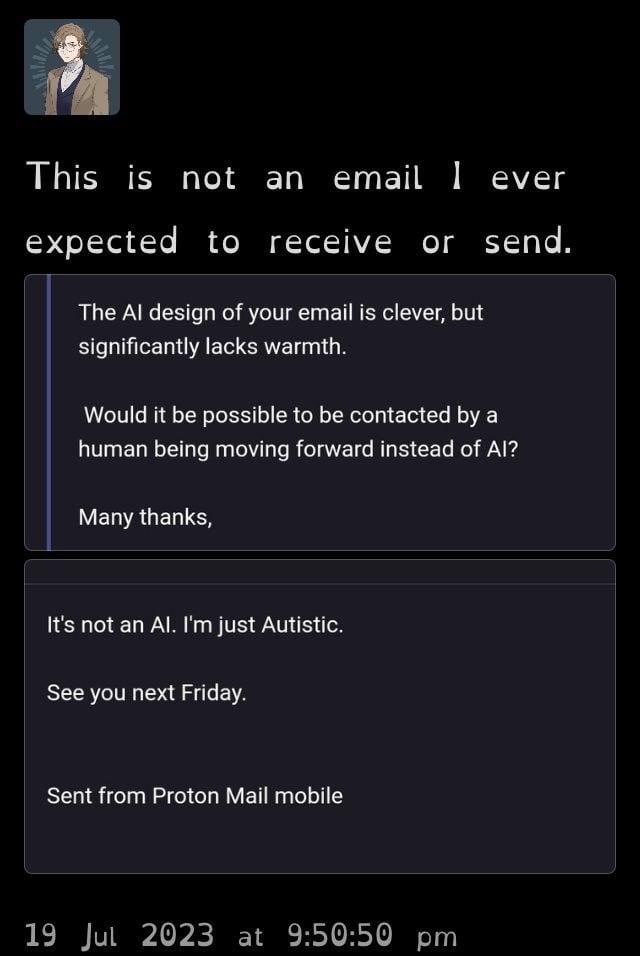
I monitor the main email account where I work and we once got an email complimenting us about how helpful our AI web chat support was.
Our web chat support is all humans.
“Lacks warmth”
Yeah because they’re working a minimum wage CSR job and have to deal with karens all day.
What is “AI design” in the context of an individual email?
Strange phrasing. Like something a robot would say to try to sound human.
It’s AIs all the way down…
Just a heads up, I can still read the names through the censoring
Thank you. Someone messaged me the same. I don’t think reposting publicly posted tweets counts as doxxing, I was just erring on the side of caution. But I’ll use the box-fill method in future. Thanks again!
Basshunter really was ahead of his time. Boten Anna was released in 2006, almost 20 years ago!
What in the name of the gods is that font 🤔
Open dyslexic. There’s an in-depth discussion about it in the comments b
Removed by mod
This font is an abomination worse than Comic Sans.
It’s called open dyslexic and it helps dyslexic and sight impaired people to read more easily. There’s a long discussion about it below.
Sadly, there’s no real evidence it helps
Are you dyslexic or sight impaired yourself? I have macular issues. It sure as hell helps me to read. I’m not saying this is the only font that could do it, but but it’s the only one pre install on kindle that does.
I find any of these dyslexic fonts harder to read. The less uniform it is, the more stuttered and slow I read it. I don’t have dyslexia though, so I guess that makes sense maybe
i think this is a special font that helps against dyslexia (not proven, sadly)
Anecdote of one, my dyslexic cousin finds it helpful.
i read somewhere that science saids it changes nothing (i have no source at all, sorry)
Lol no worries, an anecdote is an anecdote.
I’ve never seen it, but I kind of like it. For some reason it reminds me of what text looked like on 16bit era games. Makes me think of that All Your Base Are Belong To Us thing.
If the OOP falls here one day, I recommend Atkinson Hyperglide Font which was made with the same goals!
What’s Atkinson? Google’s not giving me anything relevant.
I believe they’re referring to an alternative font, Atkinson hyperlegible. The person in the image is using (I believe) Open Dyslexic, and I think the person you’re replying to is suggesting Atkinson hyperlegible as an alternative for anyone who has tried Open Dyslexic
Ah, thanks!
I edited my comment, sorry I was at work, but indeed I was talking about Atkinson Hyperglide Font! I used a lot Open Dyslexic before personally, and switching to Atkinson Hyperlegible felt as good to read then Open Dyslexic, while also looking a bit less weird to some colleagues, and being quite Beautiful, I’m very happy with it, getting the best of both worlds!
I get what you mean, Open Dyslexic can look quite jarring
+1 on Atkinson Hyperlegible. It looks prettier (IMO) whilst still being legible. Wish it had more weights tho
too5meirlfor7meirl
Genuinely I could see it picking up on that satisfying questions and just saying “Sorry I’m autistic” if it gets backed into a corner lol
deleted by creator
Blasted into the stratosphere. Holy fuck.
I wish I could respond this way at work but I don’t want others to know.
Yay! Opendyslexic font! 🥰 It’s either that or Comic Sans, or else I’m confusing my b’s with my d’s.
Sounds like something an AI would say.


