Hi, firstly thank you to all the beta testers that have helped find bugs and issues. I hope this release is even more stable as a result. It’s been a couple days since the last release so I was able to get a lot done in this one. Big changes include a bottom navigation drawer, comment navigation, and improvements to the settings page.
What’s new
- Optional bottom navigation drawer
- Comment ‘next’ 'prev navigation bar
- Left hand/ right hand mode which squishes comment actions to the left or right.
- Setting to mark post as read when viewing image
- Added setting for changing the theme text colour
- Community label is displayed in the profile list of posts
- Ability to mark posts as read when viewing images
- Ability to fix the top bar
- Added sort option for Top ‘1 hour’
- Clicking links now first confirms with the user
Fixes
- Memory optimizations to make scrolling smoother
- After adding reply, no longer switch to single thread view
- Fixed issue with reply button
- Display message when all posts in a list are being filtered
- Fixed issue with editing replies with special characters
- Improved comment navigator to scroll to a more centered position
- Added a post image to the settings post edit page
- Fixed issue with preload option not saving
- Bell notification icon should update a bit more smartly
Links:
-kuroneko
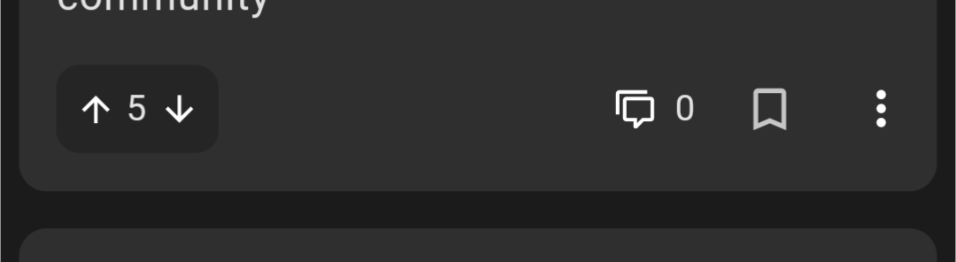
Currently on Beta 89. Liking the restyle on posts. But I think the targets on the upvote / downvote buttons need to be about 200% bigger. Spent way too much time trying (and failing) to upvote a post this morning.
Will be in the next beta release! Hopefully later today.
Much better. Though I’d even say the target could be bigger yet.
About one-third of the time, I still miss, which just opens the post.
Amazing work, thank you. One piece of feedback: I would really love it if the top navigation would be visible after a bit of scrolling up, not after scrolling all the way up to the top (if that makes sense?).
RiF did that, after scrolling about half a page up, the top navigation came to view already, making it easier to navigate between top, best, saved, etc, and to access your settings and profile.
Would that be possible?
To build off your comment. I would like to see the post topic in the top bar when browsing the comments, I sometimes forget what was the topic when I’m looking at comments (most of the time when I come back to it later). It would be nice not having to scroll all the way to the top. I hope that makes sense.
Also, a refresh button that’s not in the sub menu.
Real talk: this app is great, and you’ve clearly poured like a month into it non-stop. Do you have a job? Is this your job right now? What’s the financial plan for the app, or are you just winging it? ;)
I have a job in a related field, this is just for fun and I think having nice native apps will help Lemmy succeed as a platform.
You’re awesome! If you’re in Winnipeg, I’d buy you a beer :)