
- cross-posted to:
- lemmyshitpost@lemmy.world
- cross-posted to:
- lemmyshitpost@lemmy.world
cross-posted from: https://midwest.social/post/21866907
You must log in or register to comment.
Lol, must be a headache for the devs maintaining it, but from the end user perspective it is way more pleasant of an experience than epic, origin, gog, ubi and whatever else is out there.
I prefer it to most ui these days, tbh. Everything is either hypergeometric and boring, or forces mobile website design into desktop use for no good reason.
Flat design overdone like today is horrid
It certainly has character!
Steam does just that though, it’s design is shit for desktop.
Whatever you do don’t look up the video where a ux person fixes steam it will make you more annoyed.
Do you have a link? I will live with my regrets. Lol
Definitely wish this redesign could actually happen. Thanks for sharing!
And i hope it never changes. It works. Don’t touch it!
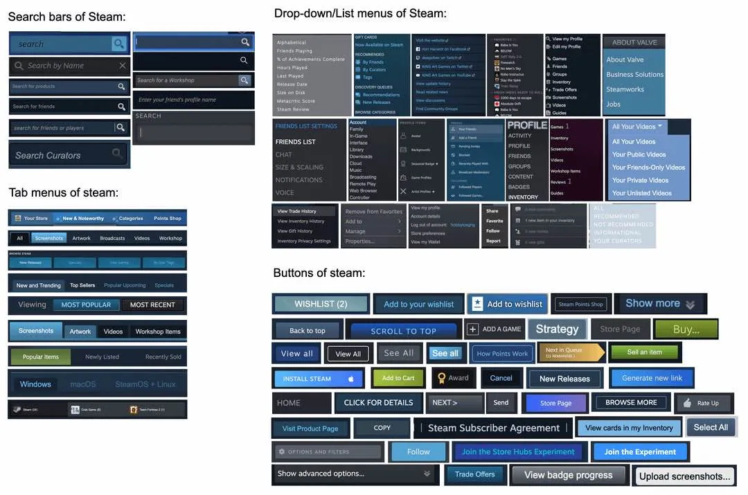
Counterpoint: I can identify which part of the UI most of those come from. This level of variety between various UI functions is actually good. I don’t want the interface tabs or the settings tabs to be confused with tabs in the store, even though they are all tabs. I don’t want buttons to all look the same, especially not the huge purchase button. But even accepting that as an outlier I want some buttons to be clearly part of the steam UI and some as part of the site page I am on, so I don’t get confused.
Steam has a decade of different design choices stacked on top of each other. It’s weird AF that they just don’t update some of their old styles, but what’re gonna do?
this might be THe only thing i like about steam
Bring back steam skins.
Me mad.
deleted by creator
Wow. This comments section reads like 50 various versions of Colin Robinson, all swarming on this very post. Every single one of them finding a way to be more pedantic or curmudgeonly than the other.
deleted by creator
Wait till you discover windows ui. Fucking backup tool having advanced options that display 2 of the 3 options and you have to click more to see the third option. and then you realize the advanced options are the basic options. Absolute clown os.
Reminds me of Windows UI — usable, but inconsistent. Obviously a lot of glommed on tech debt that was never updated.
Why did that get downvotes? This meme here is a remake of the meme about Windows’ UIs.
Can’t you customize steam with CSS tho. But holy shit I didnt notice this until now.
Miraculously still better than GOG Galaxy…
Give me the classic green/gray with white or orange/yellow text plz