- cross-posted to:
- fediverse@lemmy.ml
- cross-posted to:
- fediverse@lemmy.ml
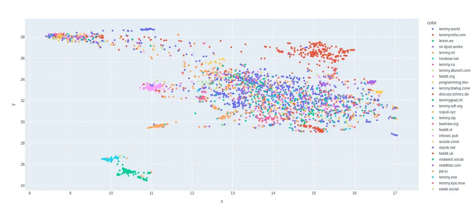
This is my first try at creating a map of lemmy. I based it on the overlap of commentors that visited certain communities.
I only used communities that were on the top 35 active instances for the past month and limited the comments to go back to a maximum of August 1 2024 (sometimes shorter if I got an invalid response.)
I scaled it so it was based on percentage of comments made by a commentor in that community.
Here is the code for the crawler and data that was used to make the map:
You must log in or register to comment.
What do the X and Y Axis represent?
Well I used dimensionality reduction to make it 2D so the axes are how the algorithm chose to compress it.
The original data had each data point as a community and the features as a frequency of a user posting in that community.
I used dimensionality reduction to make it 2D
Huh, interesting. So is the idea to spread the data out as much an possible, while keeping “similar” communities near each other? What was the dimensionality of the original set?
Total communities: 2986
Total users: 21934
So the dimensions were reduced from (2986, 21934) to (2986, 2)
Edit: Also yeah it is using Umap for the algorithm and it does do something pretty similar to what you described.
That’s really interesting! It shows which communities share users. I am part of jlai.lu, a french-speaking community that is relatively isolated by also slrpnk.net that seems very spread out!
Would it make sense to compute the standard deviation of each instance’s communities? It would give an idea of which are islands and which are more extended. Not sure if it makes sense to compute it more on 2 dimensions or on the original 21934 though.
Yeah that sounds like a good idea so you can see how connected local communities are. Probably makes more sense to use original dimensions so no extra information is lost.
What is !steamdeck@lemmy.world doing over with the red dots 🤔
Either the people in !steamdeck@lemmy.world are pretty horny or its an artifact of the dimensionality reduction and means nothing.
Edit: Actually it could also be that it just didn’t collect enough data on that community and the most recent person was also active in nsfw communities. I was only able to get back 14ish days in the data for lemmy.world. They produce way to many comments and I got kicked out early.
Maybe it would be cool to have an interactive version where you could click on any two nodes and it would tell you the actual distance
Long distances actually don’t really mean much it can’t be guaranteed that they actually correlate to much. It is mostly the local groups that are conserved and a bit of the global structure.
The libertarians are right next to the bigtiddygothgf lol
Steamdeck is right next to animefeet
Would you be able to take a screenshot of the map and edit that in as the link URL? Nice thumbnails help a post be seen, and it might let people see the map when the site is getting a hug of death 😄Then just have the website link at the top of the postedit: It loaded for me, and I see why a screenshot wouldn’t make sense. There’s so much cool detail, thanks for sharing!
I was somehow able to get both a picture and url added and it looks much better. Thx.
So more dots means more activity total for that communities users on any community in the top 35?
Wouldn’t a bar graph be sufficient?
For example most of the red dots to the top right are nsfw communities and it was able to clump like that because the people that comment in those communities tend to comment in the other nsfw communities as well.
edit: left -> right
Ah cool, self segregating proximity map. The format makes more sense with this explanation, thank you.
I didn’t measure activity for this map. Each dot represents a community. I only used the communities that were on the top 35 instances (except lemmings.world which it couldn’t grab any comments for.)
So number of dots is number of communities, but the data relies on comments to those communities to appear in the set?
Yeah pretty much. I wanted to see communities that had similar people that commented because I thought that would be a good way to see if there were similar kinds of discussions were happening in those communities.