I like pure red light (#FF0000) because its relaxing and lessens visual information overload
Baker-Miller pink is also interesting, was proposed to reduce violence and promote calmness in prison. Also very relaxing
490-510 nanometers, I love cyans and greens. Teal and turquoise are very relaxing colors to me 😃
LOL, you would love my house and decorations. Also, this.
In terms of physiology, the color is stimulated in the brain when the eye reports input from short wave blue cone cells along with a sub-sensitivity of the long wave cones which respond secondarily to that same deep blue color, but with little or no input from the middle wave cones. The brain interprets that combination as some hue of magenta or purple, depending on the relative strengths of the cone responses.
In other words, our brains are like “🤷♂️, here’s a thing”
And you can pronounce it “foof”!
I’m a fan of synthwave. AKA Outrun. Colors from that pallette on a black background are my jam. If I have to pick one, I’d go with neon purple.
I like #B00B69. Not only for the name, but also because it’s a really nice magenta color
Color app says “Lipstick”
Ultraviolet. It makes other colors that much more cool just by being there. And it kills things.
The one positive to wearing contacts all the time is that my eyes are mostly protected from UV. I always think how cool that is even if I still avoid looking directly at UV lights out of caution.
What I call Parrish light - the distinctive tone that’s prominent in Maxfield Parrish’s paintings.
It’s a relatively subdued but clear reddish orange that I see most commonly with relatively uniform but thin thunderclouds at dusk. It makes blues and greens much more vivid, in spite of the fact that the overall amount of light is relatively low. And it’s glorious.
Favorite all-time painter!
“Raphael, imma let you finnish, but Maxfield Parrish was the one of the best painters of all time. Of all time!”
deleted by creator
Turquoise, it’s very fantasy-inspiring.
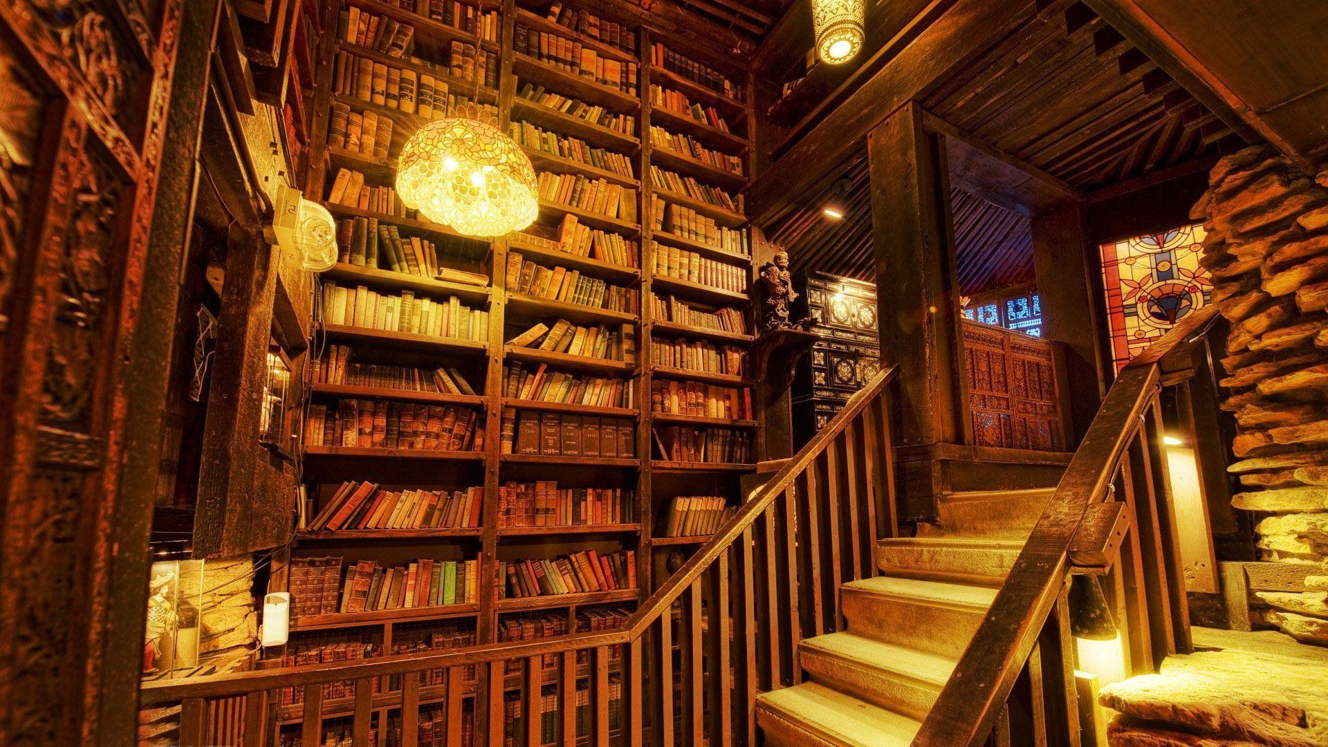
I like a yellowish/golden color I set the led bulbs in my lamps to that make it feel like an old library or bookstore.
You have a hexcode for it? Or a similar image you can link to thats the same, sounds nice
I didn’t see a hex code in the app I’m using, but it’s something like this
I think you’ll appreciate #ffcc66
#FF7700! I love this orange color and use it in all my tests.
I tend towards green.
Which one?
Sky green is best green.
#00FF00
Sear my eyes with beautiful perfect green.
As I wrote this, I didn’t read that it was about light… #fca4a4 sweet pink, kinda like salmon but more red on the Hue slider. I use it as my brand color! Even though I don’t really use it much.
#F00 is vague (there’s probably some standard that I don’t know). Can you give us a wavelength?
I like short yet visible wavelengths and the shade between blue and green (around about 525nm I believe). So Purple and greenish blue.
Nope, standard hexcode (# FF 00 00 in case its a rendering issue) The Fs mean the highest output of red light, 00 green light and 00 blue light.
Not sure if this is technically correct but I’m certain its more or less right
But is there a precise wavelength that it is supposed to have? Obviously different monitors will display them differently.
#F00 is a shorthand for #ff0000. I understand what you mean but it references a composition of the brightness of three LEDs on a screen not a colour of light which is when using a screen always just red green and blue in varying quantities.
No idea, sorry, maybe you can look it up in Wikipedia or any hexcode color search site/app I think. I have an app and my Hue stuff mainly so I just experiment with that and save whatever I want to use