Humans probably shouldn’t be living in these conditions if they can’t survive without AC, no?
Would you say the same about places where it gets well below freezing in the winter?
Edit: Many older houses don’t have AC in Vegas. They use evaporative cooling mostly.
It’s easier and more efficient to wrap yourself up with blankets and covers and use minimal heating (with decent home insulation) to warm yourself up than it is to cool down when you are too hot.
At an individual level sure, it’s easy to throw on a blanket when it’s cold. But at a household level, much more energy is used to heat homes.
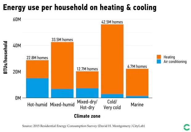
https://www.bloomberg.com/news/articles/2019-07-10/why-we-always-fight-over-air-conditioning

Interesting article!
Its pretty US centric though so I think one would have to contrast that against the UK and Europe which generally has homes that are brick and concrete rather than lumber, we also have (I believe) tighter insulation regulations and - just generally - vastly smaller homes.
I think if US houses were built to European regs and sizes then the numbers would look much different.
Also, most existing homes were built when energy was very nearly free, so that there was no incentive to be efficient.
yeah if you don’t have heating (wood, pellets, gas, fossil, electric, whatever) you can’t live in that climate. its, like, a thing.
but its way easier to heat a thing and keep it warm than cool a thing.

huh. I was just looking at air conditioners being really inefficient and it being really hard to keep a thing cool passively because all the stuff we do/have makes heat nowadays.
It’s easy to passively cool things, as long as you’re okay getting them wet :)
me? yes. my living space? less.
The laws of thermodynamics disagree
Edit: the downvoters may want to actually learn about this https://www.scienceabc.com/eyeopeners/why-does-it-take-more-energy-to-heat-a-home-than-to-cool-one.html
https://www.bloomberg.com/news/articles/2019-07-10/why-we-always-fight-over-air-conditioning
Pepperidge Farm remembers
Edit: Many older houses don’t have AC in Vegas. They use evaporative cooling mostly.
So they waste more water but less energy.
Colder climates have their challenges, but tend to have more energy-efficient solutions than hot ones. Then there ae the wonderful places with brutally cold winters and boiling summers, so you get the worst of both worlds.
Was there last month and it was like a hair dryer blowing into your face the enitre time.
That sounds like my worst nightmare.
I grew up in Vegas. I’d hang out outside with friends all night in the summer. The nights used to be a break from the heat, now it’s just always hot. Plus the removal of almost all grass contributes to the heat island effect. The grass needed to go, but it wasn’t without consequences.
looks up conversion to SI units annoyedly
Yeah it’s crazy. It’s almost like plopping down a big ass city in the middle of the fucking desert was a terrible idea. And then continuing to run it even while the climate dials up that latitude from char to incinerate.
Las Vegas grew out of being a train stop for water. Yes, water.
It was a necessity. Example: All the towns across the plains were spaced apart almost equidistant 5-7 miles as that was far each train could go before the locomotive needed water refills. Can’t imagine how annoying it would be to ride those early trains.
It also begs the question, are all those towns, as they ghost away, necessary? They served a purpose once in the 1800s. People bemoan the loss of small town America, but a lot of it was literally to fuel the primitive railroads. Maybe some of them no longer have a purpose.
Back on topic, Las Vegas certainly doesn’t.
What purpose does any city serve?
The largest water reservoir in the US is a few miles away. A large air force base was built on the, then, out skirts of town, the nuclear testing site, and the magnesium plant in nearby Henderson. All of which helped the US in WWII. That’s why Las Vegas isn’t a ghost town. It’s much more than gambling and debauchery. If that’s all it took, then why isn’t Pahrump (where prostitution is legal) a big city? What happened to Reno, which used to be the place to go party?
I think Lemmy users are incredibly ignorant of Las Vegas and should get a little bit of reading in before trashing my home town.
You also may want to let the 2 million plus residents know their city is not necessary.
But … but all that gambling money…
It’s so hot, I know a guy who’s moving out. It’s like an oven out there.
Beside the point, but this data visualization is misleadingly bad.
Eyes first draw to the heading, which primes us to think temperature. Then we see the graph, where the unlabeled Y axis is assumed to be average night temperature. Finally, we read the subheading and it says that the Y axis is not temperature, but counts of days over a certain temperature.
I think that this metric is more useful than “avg. overnight temp.”, but please label axes.
Also, it would help to rephrase the subheading to use “80” since that’s obviously the cutoff. I spent a moment wondering what was special about 79F.
And now I see that this was made by the NYT. I guess they’re pumping out charts (maybe automatically) and thinking more about making them pretty than legible.
Are you looking at the same article as me? On both the NYT app and the website using this link, I see a heading that exactly matches the data displayed. It’s a dynamic page that adjusts the figure as you scroll and the heading clearly matches the data. It says “abnormally hot nights” in every bar chart, and temperature for all of the line graphs. NYT has some really nice visualizations, with the notable exception of the potato graphic the other week with your states electric production sources - that was hot dog shit. There’s a different baseline temp for the hot night graphs depending on the city - this clearly responds to a low level baseline pre-warming.
I showed this to my partner who isn’t an engineer and she thought it made perfect sense too. Not that my anecdotes are special, but I truly don’t understand the confusion.
They’re technically labeled the same way an “exit” sign is labeled on the Walmart doors. There but shitty.