

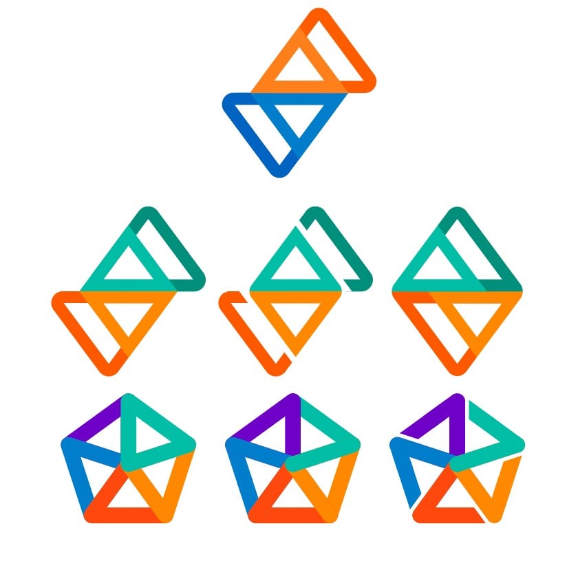
These are my takes on alternate Sync logos for Lemmy (I made that rat from a while ago)
The logo for Sync is so tied to Reddit for me personally, that it was hard to think of ways to translate it to Lemmy (or the Fediverse overall).
Orange and Blue are signature colours for Reddit, but Lemmy doesnt necessarily have a colour scheme. Nor should it. that’s up to the instance operators to choose, making their community unique.
I also like the general Fediverse pentagon logo, but it can look quite busy…
I did what I could. I’m an average designer at best ¯_(ツ)_/¯
You must log in or register to comment.
Uh, ignore the pride-themed swaztika with an extra arm
LGBTQanon logo
Use the original logo but swap colors or make them negative as a symbolism that Lemmy is the opposite of Reddit.
The best is still the original, but with colors swapped. AKA, the current logo
middle right or bottom left. the other 2 bottom ones give off some old germany vibes of not happy times
This Nazi Party rebranding is not going well
Emphasise the Party part? (Nazi Party Party! - Party?)
I really like the middle one.
Middle middle is great! I like middle left, too.
Pretty good. If you don’t want to do it, send me the images so I can fix the banner and icon, because I didn’t spend enough time on the icon cleanup.
Cheers Margot Robbie.
She’s a champion, taking time out of her movie promo schedule to spend a night photoshopping.
Middle left or middle right.
Any of the middle ones!
Middle middle. Simple and elegant. The fediverse looks great but might be a pain. If it isn’t, I say bottom right.
Middle left, if it’s to similar with just the color change then go middle right. Middle right has a clean simple look and good symmetry.
Rat is top option. Any from the middle row, but I’m partial to the center one
Burn the bottom row.
I like the middle left and bottom right.
Now I can’t unsee it after someone says it looks like a guy walking
Bottom right is cool in a vacuum, but there’s like… a shade of swastika to it? I dunno, maybe that’s just extremely online of me, but I’d be a little hesitant on it for that reason as compared to middle bottom.
The one that strikes my fancy the most is middle right, maybe just because it reminds me a little bit of Strava. Maybe the Fediverse colors could be applied to that one in some way, maybe teal and blue on top, red and orange on bottom, and purple as a fill? Or blue and purple on top with teal as a fill. In my head that looks cool, but in practice it might look like total ass. Worth trying anyway imo.
Middle and bottom middle look good
Middle all the way down


